14 Animating views
14.1 Animation API
Both plot_ly() and ggplotly() support key frame animations through the frame argument/aesthetic. They also support an ids argument/aesthetic to ensure smooth transitions between objects with the same id (which helps facilitate object constancy). Figure 14.1 recreates the famous gapminder animation of the evolution in the relationship between GDP per capita and life expectancy evolved over time (Bryan 2015). The data is recorded on a yearly basis, so the year is assigned to frame, and each point in the scatterplot represents a country, so the country is assigned to ids, ensuring a smooth transition from year to year for a given country.
data(gapminder, package = "gapminder")
gg <- ggplot(gapminder, aes(gdpPercap, lifeExp, color = continent)) +
  geom_point(aes(size = pop, frame = year, ids = country)) +
  scale_x_log10()
ggplotly(gg)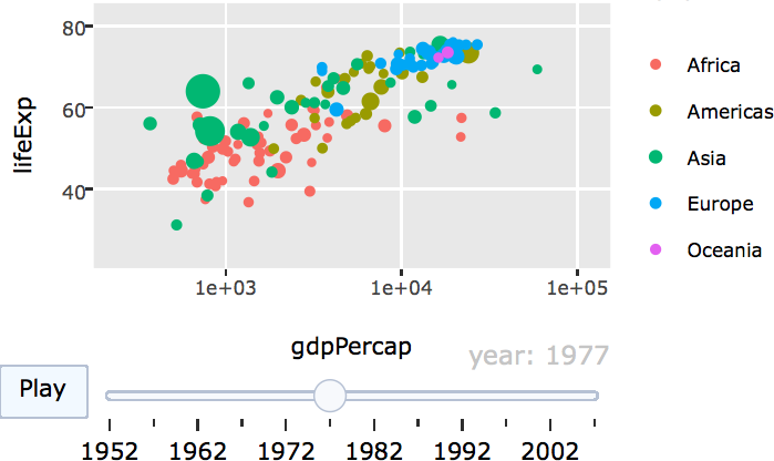
FIGURE 14.1: Animation of the evolution in the relationship between GDP per capita and life expectancy in numerous countries.
As long as a frame variable is provided, an animation is produced with play/pause button(s) and a slider component for controlling the animation. These components can be removed or customized via the animation_button() and animation_slider() functions. Moreover, various animation options, like the amount of time between frames, the smooth transition duration, and the type of transition easing may be altered via the animation_opts() function. Figure 14.2 shows the same data as Figure 14.1, but doubles the amount of time between frames, uses linear transition easing, places the animation buttons closer to the slider, and modifies the default currentvalue.prefix settings for the slider.
base <- gapminder %>%
  plot_ly(x = ~gdpPercap, y = ~lifeExp, size = ~pop,
          text = ~country, hoverinfo = "text") %>%
  layout(xaxis = list(type = "log"))

base %>%
  add_markers(color = ~continent, frame = ~year, ids = ~country) %>%
  animation_opts(1000, easing = "elastic", redraw = FALSE) %>%
  animation_button(
    x = 1, xanchor = "right", y = 0, yanchor = "bottom"
  ) %>%
  animation_slider(
    currentvalue = list(prefix = "YEAR ", font = list(color="red"))
  )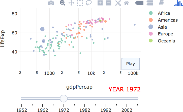
FIGURE 14.2: Modifying animation defaults with animation_opts(), animation_button(), and animation_slider().
If frame is a numeric variable (or a character string), frames are always ordered in increasing (alphabetical) order; but for factors, the ordering reflects the ordering of the levels. Consequently, factors provide the most control over the ordering of frames. In Figure 14.3, the continents (i.e., frames) are ordered according their average life expectancy across countries within the continent. Furthermore, since there is no meaningful relationship between objects in different frames of Figure 14.3, the smooth transition duration is set to 0. This helps avoid any confusion that there is a meaningful connection between the smooth transitions. Note that these options control both animations triggered by the play button or via the slider.
meanLife <- with(gapminder, tapply(lifeExp, INDEX = continent, mean))
gapminder$continent <- factor(
  gapminder$continent, levels = names(sort(meanLife))
)

base %>%
  add_markers(data = gapminder, frame = ~continent) %>%
  hide_legend() %>%
  animation_opts(frame = 1000, transition = 0, redraw = FALSE)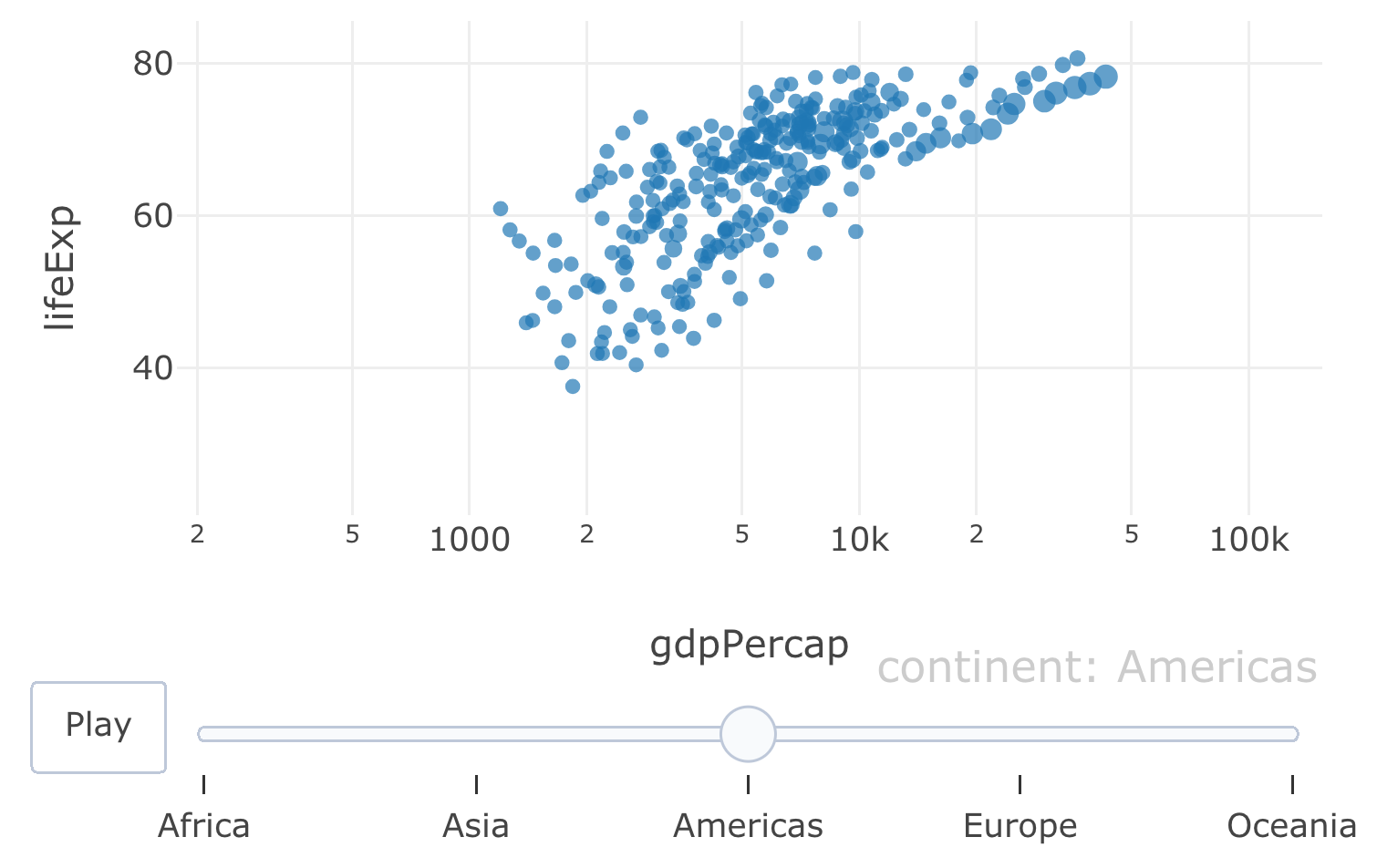
FIGURE 14.3: Animation of GDP per capita versus life expectancy by continent. The ordering of the continents goes from lowest average (across countries) life expectancy to highest.
Both the frame and ids attributes operate on the trace level – meaning that we can target specific layers of the graph to be animated. One obvious use case for this is to provide a background which displays every possible frame (which is not animated) and overlay the animated frames onto that background. Figure 14.4 shows the same information as Figure 14.2, but layers animated frames on top of a background of all the frames. As a result, it is easier to put a specific year into a global context.
base %>%
  add_markers(
    color = ~continent, showlegend = F,
    alpha = 0.2, alpha_stroke = 0.2
  ) %>%
  add_markers(color = ~continent, frame = ~year, ids = ~country) %>%
  animation_opts(1000, redraw = FALSE)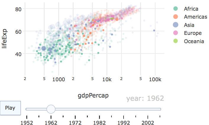
FIGURE 14.4: Overlaying animated frames on top of a background of all possible frames.
14.2 Animation support
At the time of writing, the scatter plotly.js trace type is really the only trace type with full support for animation. That means, we need to get a little imaginative to animate certain things, like a population pyramid chart (essentially a bar chart) using add_segments() (a scatter-based layer) instead of add_bars() (a non-scatter layer). Figure 14.5 shows projections for male & female population by age from 2018 to 2050 using data obtained via the idbr package (Walker 2018).
library(idbr)
library(dplyr)

us <- bind_rows(
  idb1(
    country = "US",
    year = 2018:2050,
    variables = c("AGE", "NAME", "POP"),
    sex = "male"
  ),
  idb1(
    country = "US",
    year = 2018:2050,
    variables = c("AGE", "NAME", "POP"),
    sex = "female"
  )
)

us <- us %>%
  mutate(
    POP = if_else(SEX == 1, POP, -POP),
    SEX = if_else(SEX == 1, "Male", "Female")
  )

plot_ly(us, size = I(5), alpha  = 0.5) %>%
  add_segments(
    x = ~POP, xend = 0,
    y = ~AGE, yend = ~AGE,
    frame = ~time,
    color = ~factor(SEX)
  )
FIGURE 14.5: US population projections by age and gender from 2018 to 2050. This population pyramid is implemented with thick line segments to give the appearance of bars. For the interactive, see https://plotly-r.com/interactives/profile-pyramid.html
Although population pyramids are quite popular, they aren’t necessarily the best way to visualize this information, especially if the goal is to compare the population profiles over time. It’s much easier to compare them along a common scale, as done in Figure 14.6. Note that, when animating lines in this fashion, it can help to set line.simplify to FALSE so that the number of points along the path are left unaffected.
plot_ly(us, alpha  = 0.5) %>%
  add_lines(
    x = ~AGE, y = ~abs(POP),
    frame = ~time,
    color = ~factor(SEX),
    line = list(simplify = FALSE)
  ) %>%
  layout(yaxis = list(title = "US population"))
FIGURE 14.6: Visualizing the same information in Figure 14.5 using lines rather than segments. For the interactive, see https://plotly-r.com/interactives/profile-lines.html
References
Bryan, Jennifer. 2015. Gapminder: Data from Gapminder. https://CRAN.R-project.org/package=gapminder.
Walker, Kyle. 2018. Idbr: R Interface to the Us Census Bureau International Data Base Api. https://CRAN.R-project.org/package=idbr.