25 Controlling tooltips
25.1 plot_ly() tooltips
There are two main approaches to controlling the tooltip: hoverinfo and hovertemplate. I suggest starting with the former approach since it’s simpler, more mature, and enjoys universal support across trace types. On the other hand, hovertemplate does offer a convenient approach for flexible control over tooltip text, so it can be useful as well.
The hoverinfo attribute controls what other plot attributes are shown into the tooltip text. The default value of hoverinfo is x+y+text+name (you can verify this with schema()), meaning that plotly.js will use the relevant values of x, y, text, and name to populate the tooltip text. As in Figure 25.1 shows, you can supply custom text (without the other ‘calculated values’) by supplying a character string text and setting hoverinfo = "text". The character string can include Glyphs, unicode characters, a some (white-listed) HTML entities and tags.43 At least currently, plotly.js doesn’t support rendering of LaTeX or images in the tooltip, but as demonstrated in Figure 21.3, if you know some HTML/JavaScript, you can always build your own custom tooltip.
library(tibble)
library(forcats)
tooltip_data <- tibble(
x = " ",
y = 1,
categories = as_factor(c(
"Glyphs", "HTML tags", "Unicode",
"HTML entities", "A combination"
)),
text = c(
"👋 glyphs ಠ_ಠ",
"Hello <span style='color:red'><sup>1</sup>⁄<sub>2</sub></span>
fraction",
"\U0001f44b unicode \U00AE \U00B6 \U00BF",
"μ ± & < > × ± °",
paste("<b>Wow</b> <i>much</i> options", emo::ji("dog2"))
)
plot_ly(tooltip_data, hoverinfo = "text") %>%
add_bars(
x = ~x,
y = ~y,
color = ~fct_rev(categories),
text = ~text
) %>%
layout(
barmode ="stack",
hovermode = "x"
)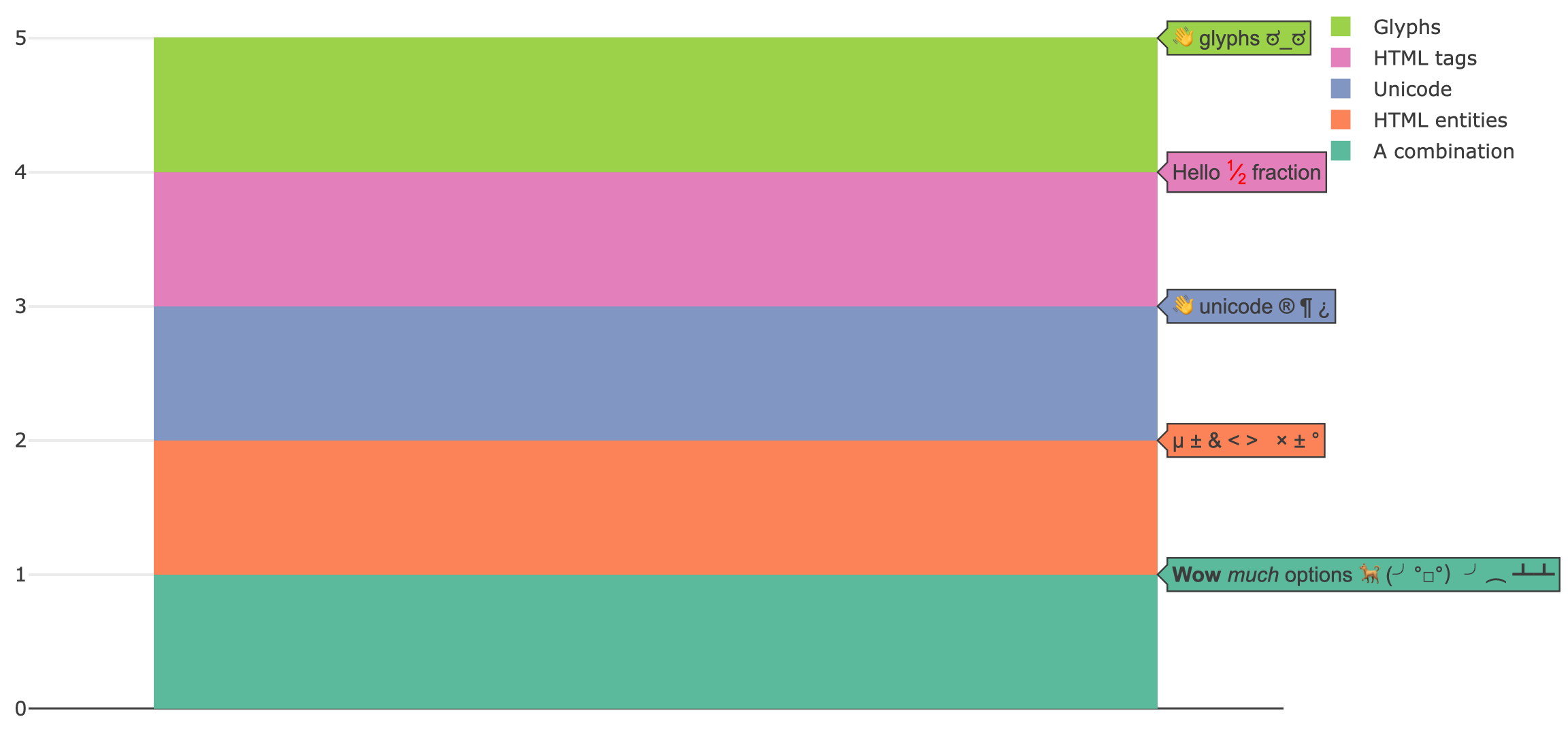
FIGURE 25.1: Customizing the tooltip by supplying glyphs, Unicode, HTML markup to the text attributes and restricting displayed attributes with hoverinfo='text'.
Whenever a fill is relevant (e.g., add_sf(), add_polygons(), add_ribbons(), etc), you have the option of using the hoveron attribute to generate a tooltip for the supplied data points, the filled polygon that those points define, or both. As Figure 25.2 demonstrates, if you want a tooltip attached to a fill, you probably want text to be of length 1 for a given trace. On the other hand, if you want to each point along a fill to have a tooltip, you probably want text to have numerous strings.
p <- plot_ly(
  x = c(1, 2, 3),
  y = c(1, 2, 1),
  fill = "toself",
  mode = "markers+lines",
  hoverinfo = "text"
)

subplot(
  add_trace(p, text = "triangle", hoveron = "fills"),
  add_trace(p, text = paste0("point", 1:3), hoveron = "points")
)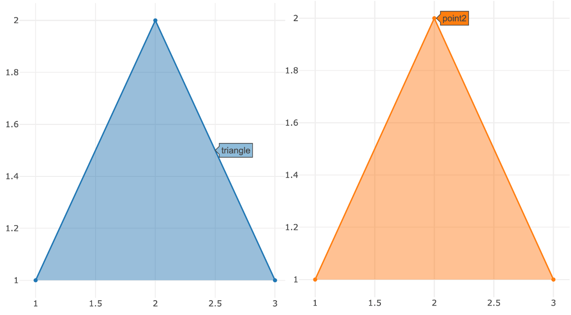
FIGURE 25.2: Using the hoveron attribute to control whether a tooltip is attached to fill or each point along that fill.
You can’t supply custom text in this way to a statistical aggregation, but there are ways to control the formatting of values computed and displayed by plotly.js (e.g. x, y, and z). If the value that you’d like to format corresponds to an axis, you can use *axis.hoverformat. The syntax behind hoverformat follows d3js’ format conventions. For numbers, see: https://github.com/d3/d3-format/blob/master/README.md#locale_format and for dates see: https://github.com/d3/d3-time-format/blob/master/README.md#locale_format
set.seed(1000)
plot_ly(x = rnorm(100), name = " ") %>%
  add_boxplot(hoverinfo = "x") %>%
  layout(xaxis = list(hoverformat = ".2f"))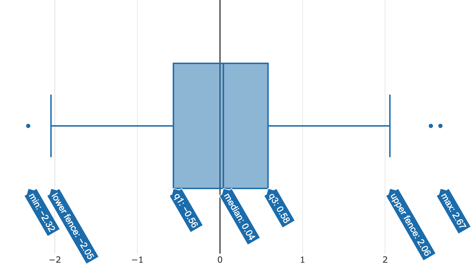
FIGURE 25.3: Using xaxis.hoverformat to round aggregated values displayed in the tooltip to two decimal places.
Computed values that don’t have a corresponding axis likely have a *hoverformat trace attribute. Probably the most common example is the z attribute in a heatmap or histogram2d chart. Figure 25.4 shows how to format z values to have one decimal.
plot_ly(z = ~volcano) %>%
  add_heatmap(zhoverformat = ".1f") %>%
  layout(xaxis = list(hoverformat = ".2f"))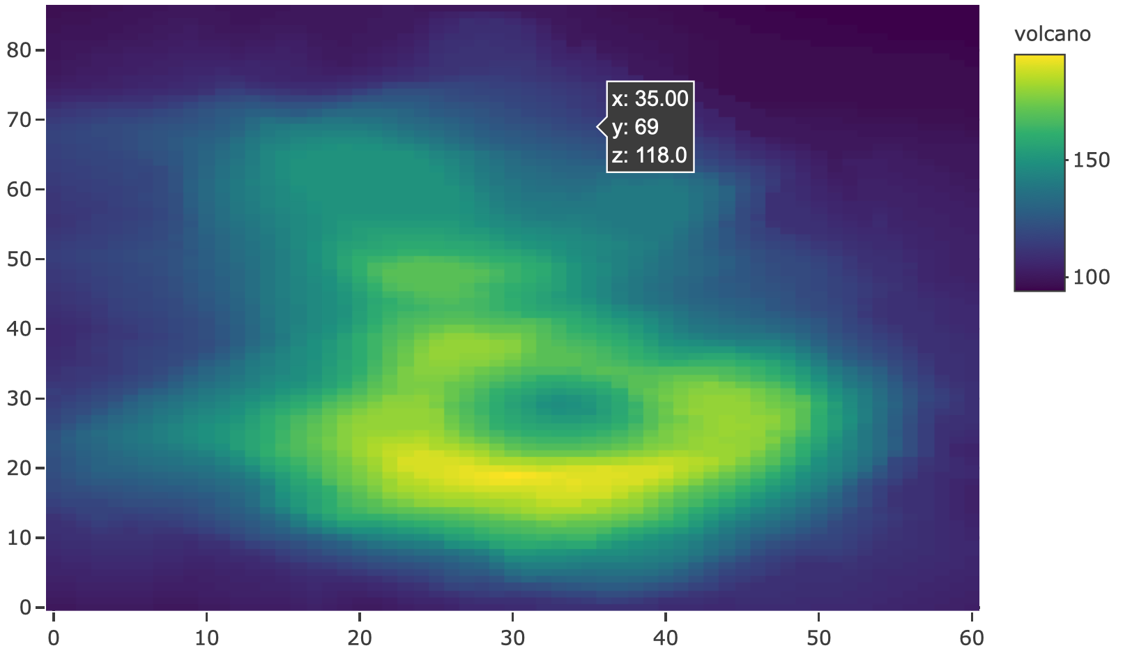
FIGURE 25.4: Formatting the displayed z values in a heatmap using zhoverformat.
It’s admittedly difficult to remember where to specify these hoverformat attributes, so if you want a combination of custom text and formatting of computed values you can use hovertemplate, which overrides hoverinfo and allows you to fully specify the tooltip in a single attribute. It does this through special markup rules for inserting and formatting data values inside a string. Figure 25.5 provides an example of inserting x and y in the tooltip through the special %{variable:format} markup as well as customization of the secondary box through <extra> tag. For a full description of this attribute, including the formatting rules, see https://plot.ly/r/reference/#scatter-hovertemplate.
set.seed(10)
plot_ly(x = rnorm(100, 0, 1e5)) %>%
  add_histogram(
    histnorm = "density",
    hovertemplate = "The height between <br> (%{x}) <br> is %{y:.1e}
    <extra>That's small!</extra>"
  )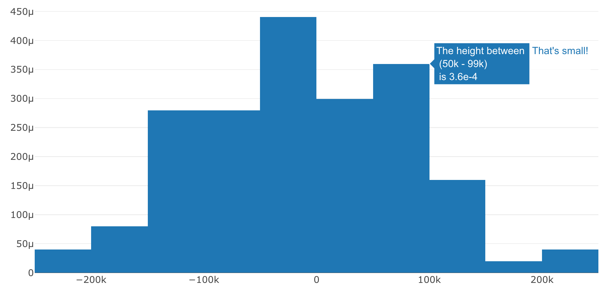
FIGURE 25.5: Using the hovertemplate attribute to reference computed variables and their display format inside a custom string.
If you need really specific control over the tooltip, you might consider hiding the tooltip altogether (using hoverinfo='none') and defining your own tooltip. Defining your own tooltip, however, will require knowledge of HTML and JavaScript – see Figure 21.3 for an example of how to display an image on hover instead of a tooltip.
25.2 ggplotly() tooltips
Similar to how you can use the text attribute to supply a custom string in plot_ly() (see Section 25.1), you can supply a text aesthetic to your ggplot2 graph, as shown in 25.6:
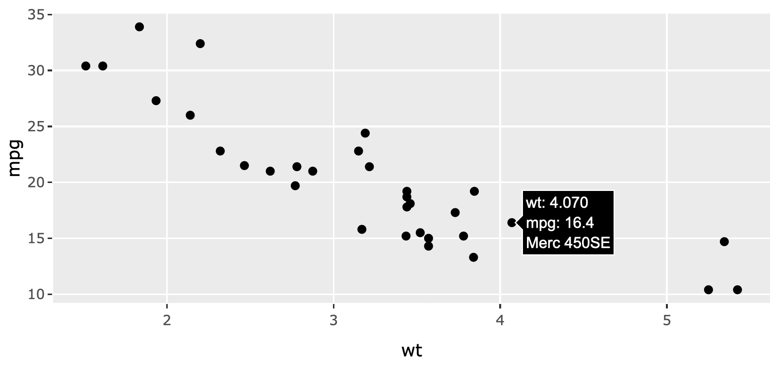
FIGURE 25.6: Using the text ggplot2 aesthetic to supply custom tooltip text to a scatterplot.
By default, ggplotly() will display all relevant aesthetic mappings (or computed values), but you can restrict what aesthetics are used to populate the tooltip, as shown in Figure 25.7:
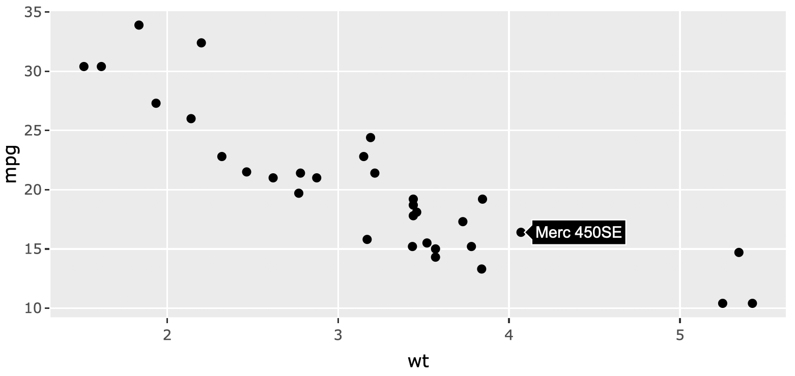
FIGURE 25.7: Using the tooltip argument in ggplotly() to only display the text aesthetic.
When constructing the text to display, ggplotly() runs format() on the computed values. Since some parameters of the format() function can be controlled through global options(), you can use these options() to control the displayed text. This includes the digits option for controlling the number of significant digits used for numerical values as well as scipen for setting a penalty for deciding whether scientific or fixed notation is used for displaying. Figure 25.8 shows how you can temporarily set these options (i.e., avoid altering of your global environment) using the withr package (Hester et al. 2018).
library(withr)
p <- ggplot(faithfuld, aes(waiting, eruptions)) +
    geom_raster(aes(fill = density))
subplot(
  with_options(list(digits = 1), ggplotly(p)),
  with_options(list(digits = 6, scipen = 20), ggplotly(p))
)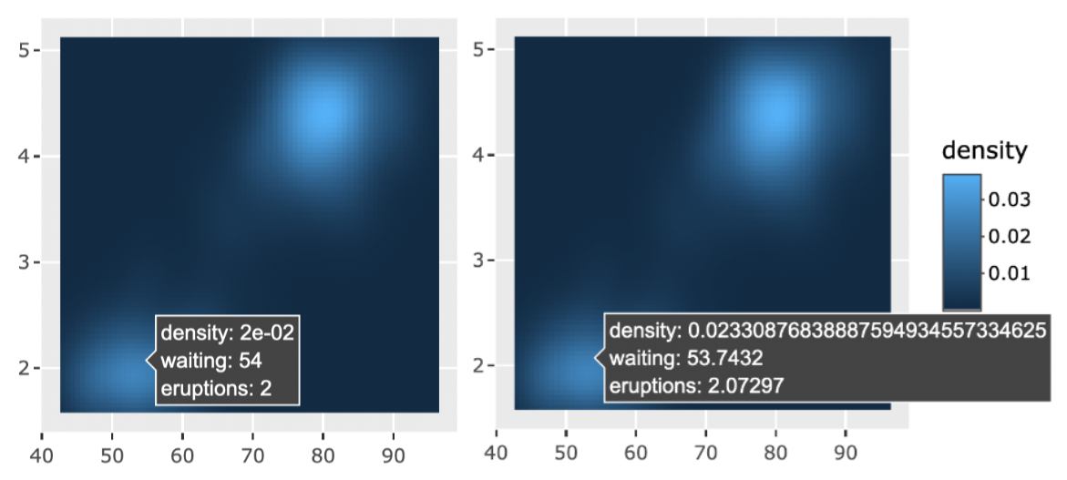
FIGURE 25.8: Leveraging global R options for controlling the displayed values in a ggplotly() tooltip.
These global options are nice for specifying significant/scientific notation, but what about more sophisticated formatting? Sometimes a clever use of the text aesthetic provides a sufficient workaround. Specifically, as Figure 25.9 shows, if one wanted to control a displayed aesthetic value (e.g., y), one could generate a custom string from that variable and supply it to text, then essentially replace text for y in the tooltip:
library(scales)
p <- ggplot(txhousing, aes(date, median)) +
  geom_line(aes(
    group = city,
    text = paste("median:", number_si(median))
  ))
ggplotly(p, tooltip = c("text", "x", "city"))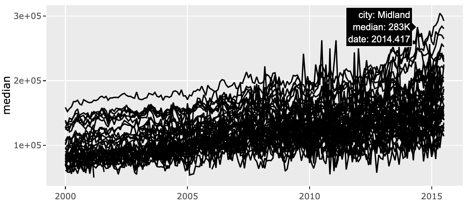
FIGURE 25.9: Using the text aesthetic to replace an auto-generated aesthetic (y).
The approach depicted in Figure 25.9 works for computed values that pertain to raw data values, but what about sophisticated formatting of a summary statistics generated by ggplot2? In this case, you’ll have to use the return value of ggplotly() which, remember, is a plotly object that conforms to the plotly.js spec. That means you can identify trace attribute(s) that contain relevant info (note: the plotly_json() function is incredibly for helping to find that information), then use that info to populate a text attribute. Figure 25.10 applies this technique to customize the text that appears when hovering over a geom_smooth() line.
# Add a smooth to the previous figure and convert to plotly
w <- ggplotly(p + geom_smooth(se = FALSE))

# This plotly object has two traces: one for
# the raw time series and one for the smooth.
# Try using `plotly_json(w)` to confirm the 2nd
# trace is the smooth line.
length(w$x$data)

# use the `y` attribute of the smooth line
# to generate a custom string (to appear in tooltip)
text_y <- number_si(
  w$x$data[[2]]$y,
  prefix = "Typical median house price: $"
)

# suppress the tooltip on the raw time series
# and supply custom text to the smooth line
w %>%
  style(hoverinfo = "skip", traces = 1) %>%
  style(text = text_y, traces = 2)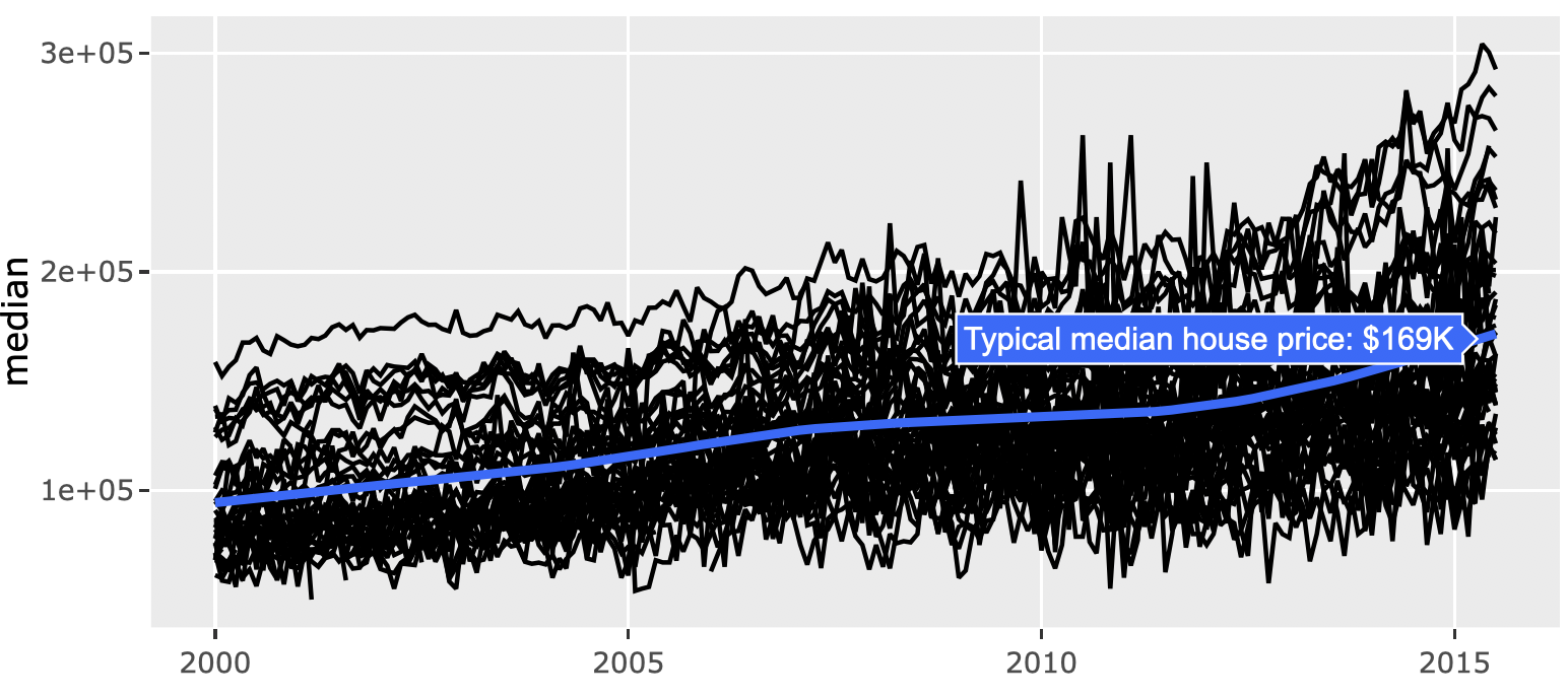
FIGURE 25.10: Using the return value of ggplotly() to populate a custom text attribute.
25.3 Styling
There is currently one main attribute for controlling the style of a tooltip: hoverlabel. With this attribute you can currently set the background color (bgcolor), border color (bordercolor), and font family/size/color. Figure 25.11 demonstrates how to use it with plot_ly() (basically any chart type you use should support it):
font <- list(
  family = "Roboto Condensed",
  size = 15,
  color = "white"
)
label <- list(
  bgcolor = "#232F34",
  bordercolor = "transparent",
  font = font
)
plot_ly(x = iris$Petal.Length, hoverlabel = label)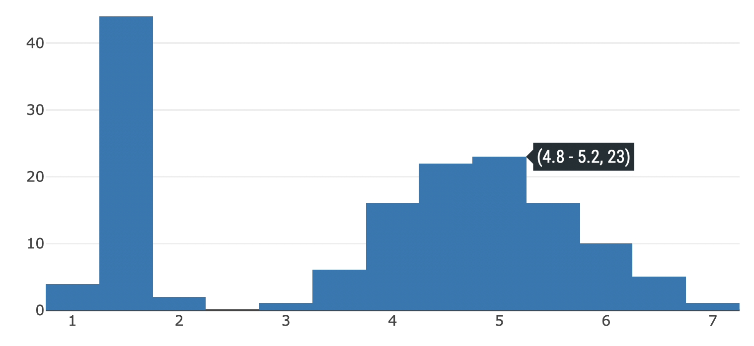
FIGURE 25.11: Using the hoverlabel attribute to customize the color and font of the tooltip.
On the other hand, when using ggplotly(), you have to modify the hoverlabel attribute via style() as shown in Figure 25.12
qplot(x = Petal.Length, data = iris) %>%
  ggplotly() %>%
  style(hoverlabel = label, marker.color = "#232F34") %>%
  layout(font = font)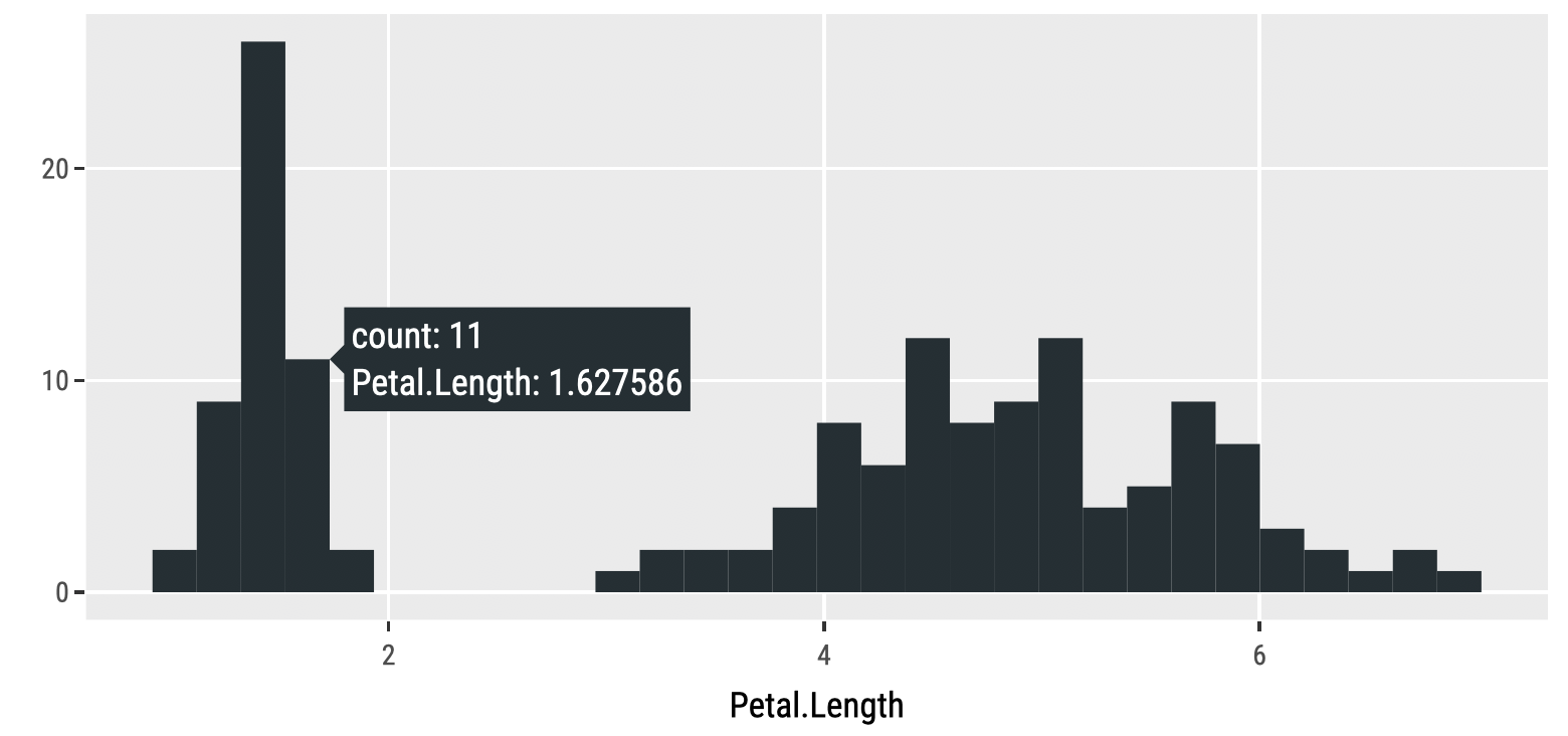
FIGURE 25.12: Using the hoverlabel attribute with ggplotly().
As shown in sections 25.1 and 25.2 the approach to customized the actual text of a tooltip is slightly different depending on whether you’re using ggplotly() or plot_ly(), but styling the appearance of the tooltip is more or less the same in either approach.
References
Hester, Jim, Kirill Müller, Kevin Ushey, Hadley Wickham, and Winston Chang. 2018. Withr: Run Code ’with’ Temporarily Modified Global State. https://CRAN.R-project.org/package=withr.
If you find a tag or entity that you want isn’t supported, please request it to be added in the plotly.js repository https://github.com/plotly/plotly.js/issues/new↩︎