8 3D charts
8.1 Markers
As it turns out, by simply adding a z attribute plot_ly() will know how to render markers, lines, and paths in three dimensions. That means, all the techniques we learned in Sections 3.1 and 3.2 can re-used for 3D charts:

FIGURE 8.1: A 3D scatterplot.
8.2 Paths
To make a path in 3D, use add_paths() in the same way you would for a 2D path, but add a third variable z, as Figure 8.2 does.
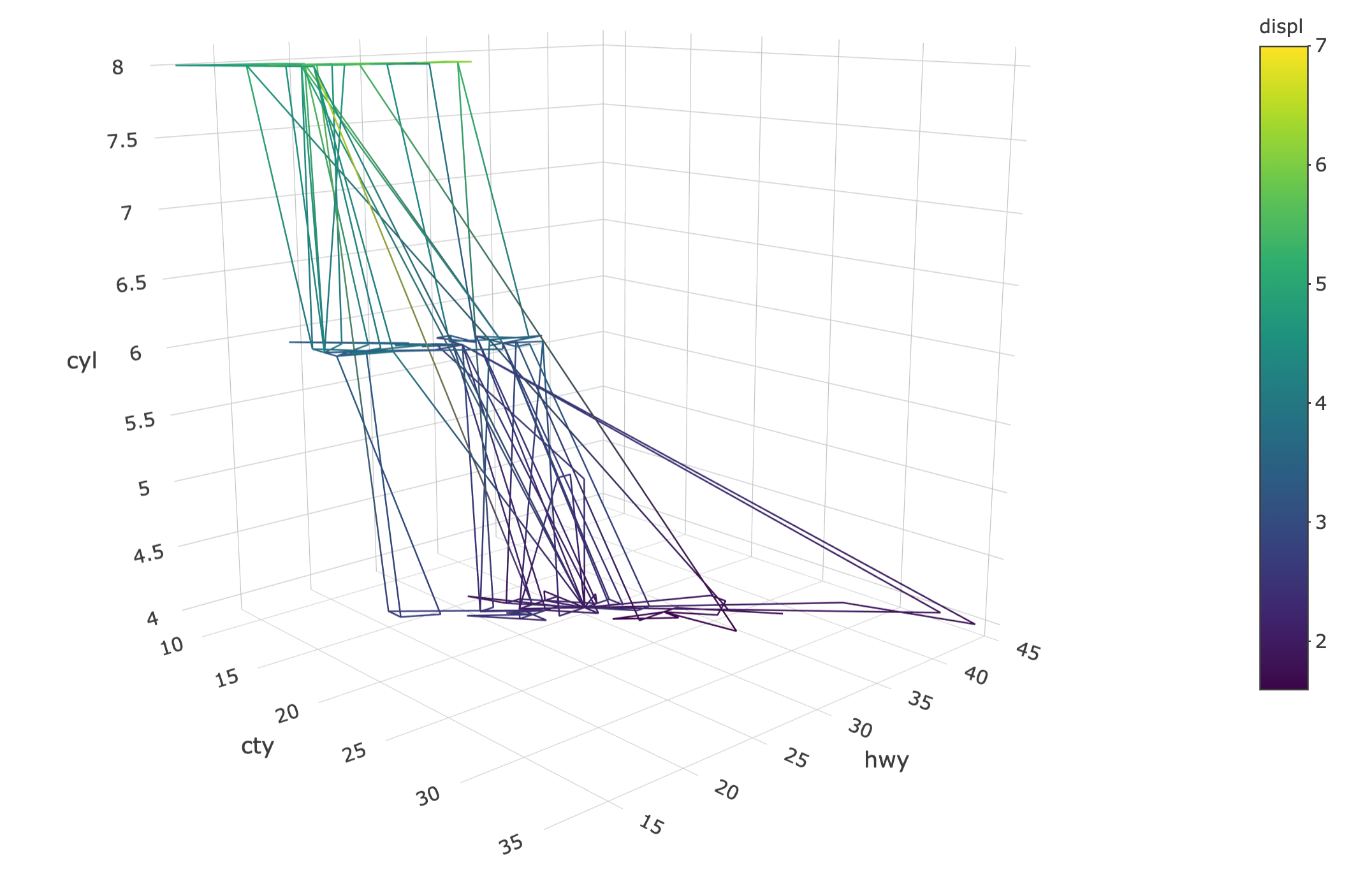
FIGURE 8.2: A path with color interpolation in 3D.
8.3 Lines
Figure 8.3 uses add_lines() instead of add_paths() to ensure the points are connected by the x axis instead of the row ordering.
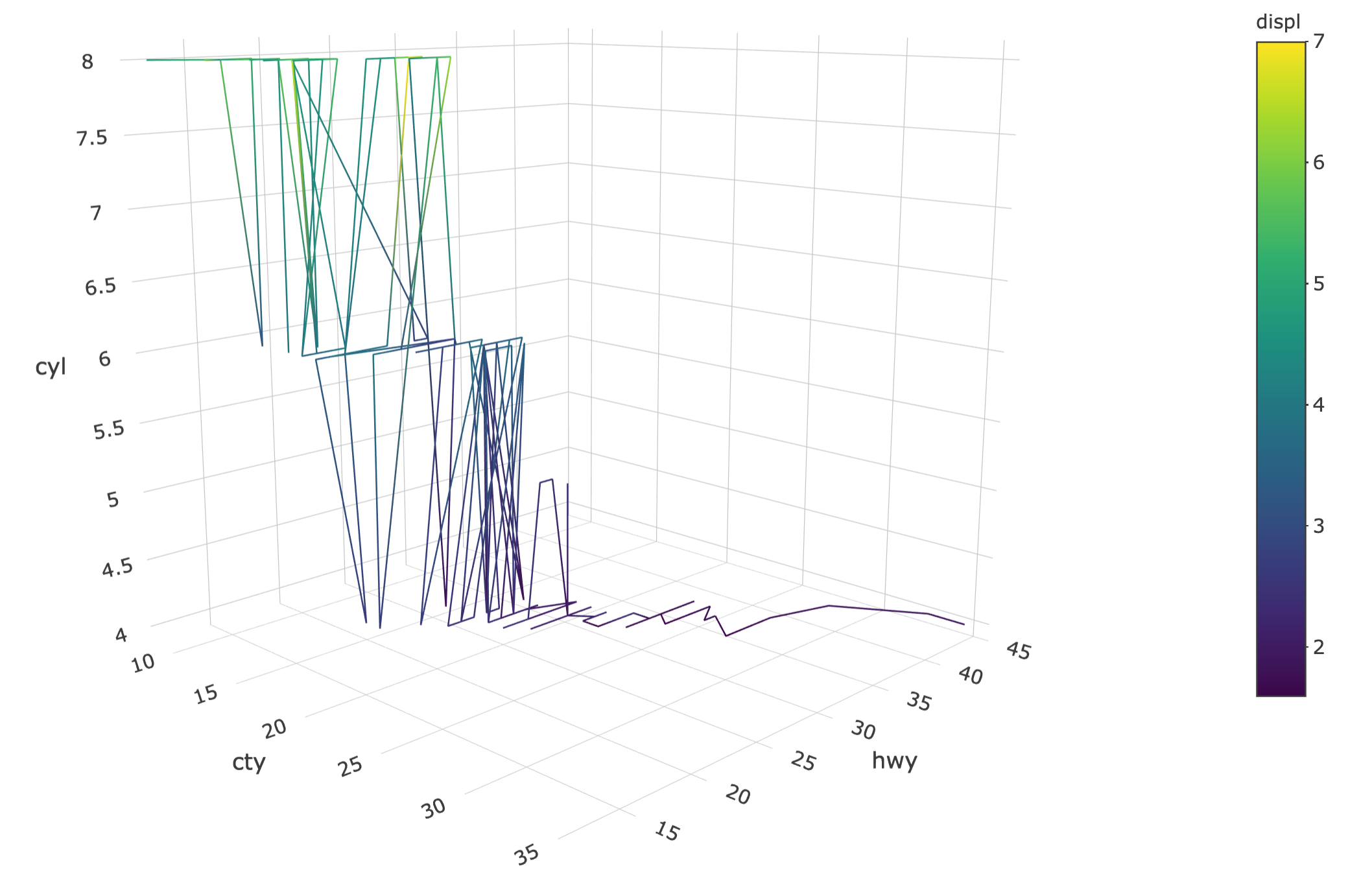
FIGURE 8.3: A line with color interpolation in 3D.
As with non-3D lines, you can make multiple lines by specifying a grouping variable.
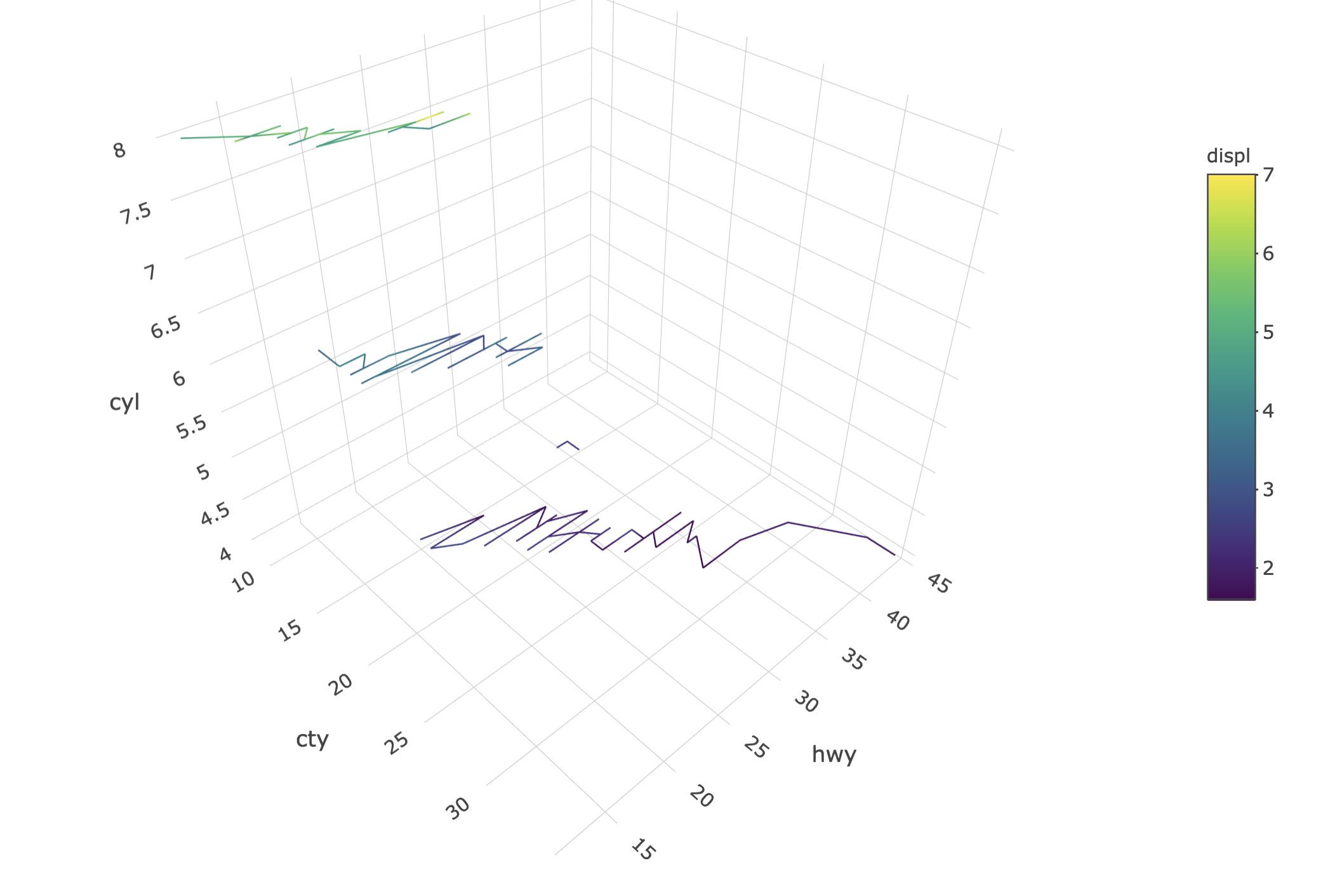
FIGURE 8.4: Using group_by() to create multiple 3D lines.
8.4 Axes
For 3D plots, be aware that the axis objects are a part of the scene definition, which is part of the layout(). That is, if you wanted to set axis titles (e.g., Figure 8.5), or something else specific to the axis definition, the relation between axes (i.e., aspectratio), or the default setting of the camera (i.e., camera); you would do so via the scence.
plot_ly(mpg, x = ~cty, y = ~hwy, z = ~cyl) %>%
add_lines(color = ~displ) %>%
layout(
scene = list(
xaxis = list(title = "MPG city"),
yaxis = list(title = "MPG highway"),
zaxis = list(title = "Number of cylinders")
)
)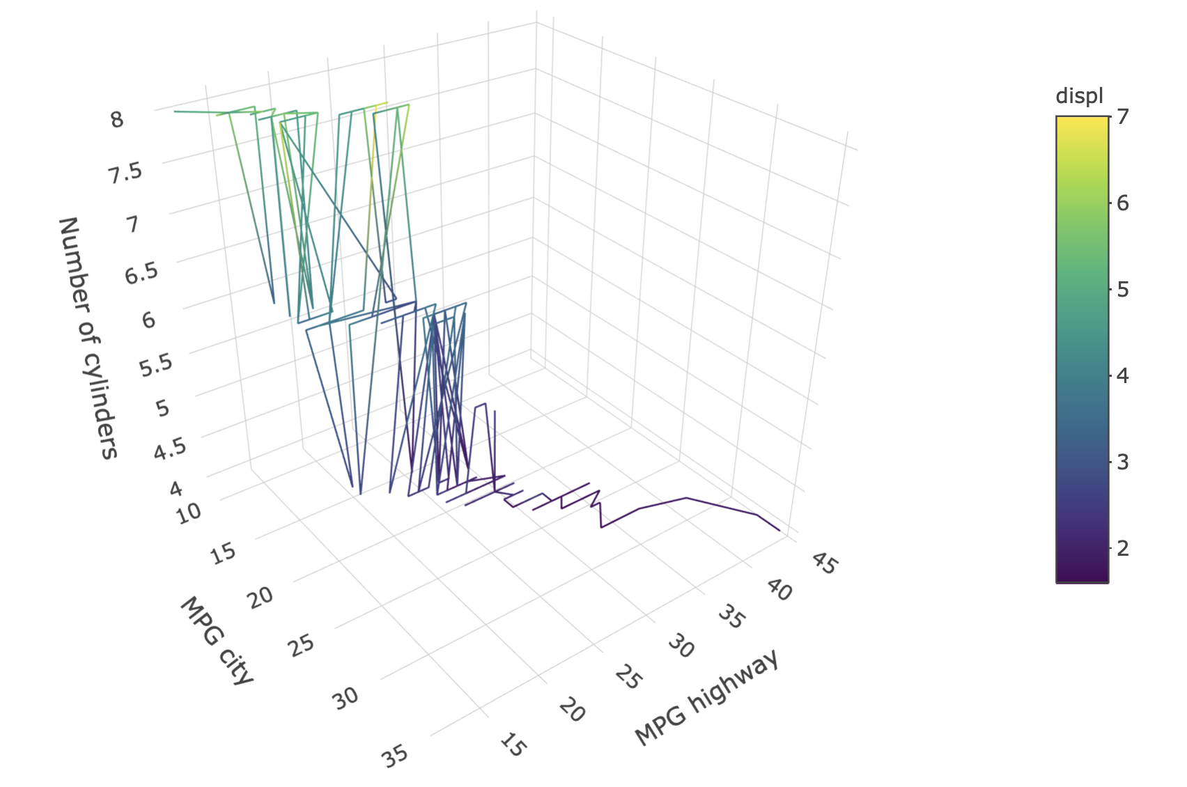
FIGURE 8.5: Setting axis titles on a 3D plot.
8.5 Surfaces
Creating 3D surfaces with add_surface() is a lot like creating heatmaps with add_heatmap(). In fact, you can even create 3D surfaces over categorical x/y (try changing add_heatmap() to add_surface() in Figure 7.3)! That being said, there should be a sensible ordering to the x/y axes in a surface plot since plotly.js interpolates z values. Usually the 3D surface is over a continuous region, as is done in Figure 8.6 to display the height of a volcano. If a numeric matrix is provided to z as in Figure 8.6, the x and y attributes do not have to be provided, but if they are, the length of x should match the number of columns in the matrix and y should match the number of rows.
x <- seq_len(nrow(volcano)) + 100
y <- seq_len(ncol(volcano)) + 500
plot_ly() %>% add_surface(x = ~x, y = ~y, z = ~volcano)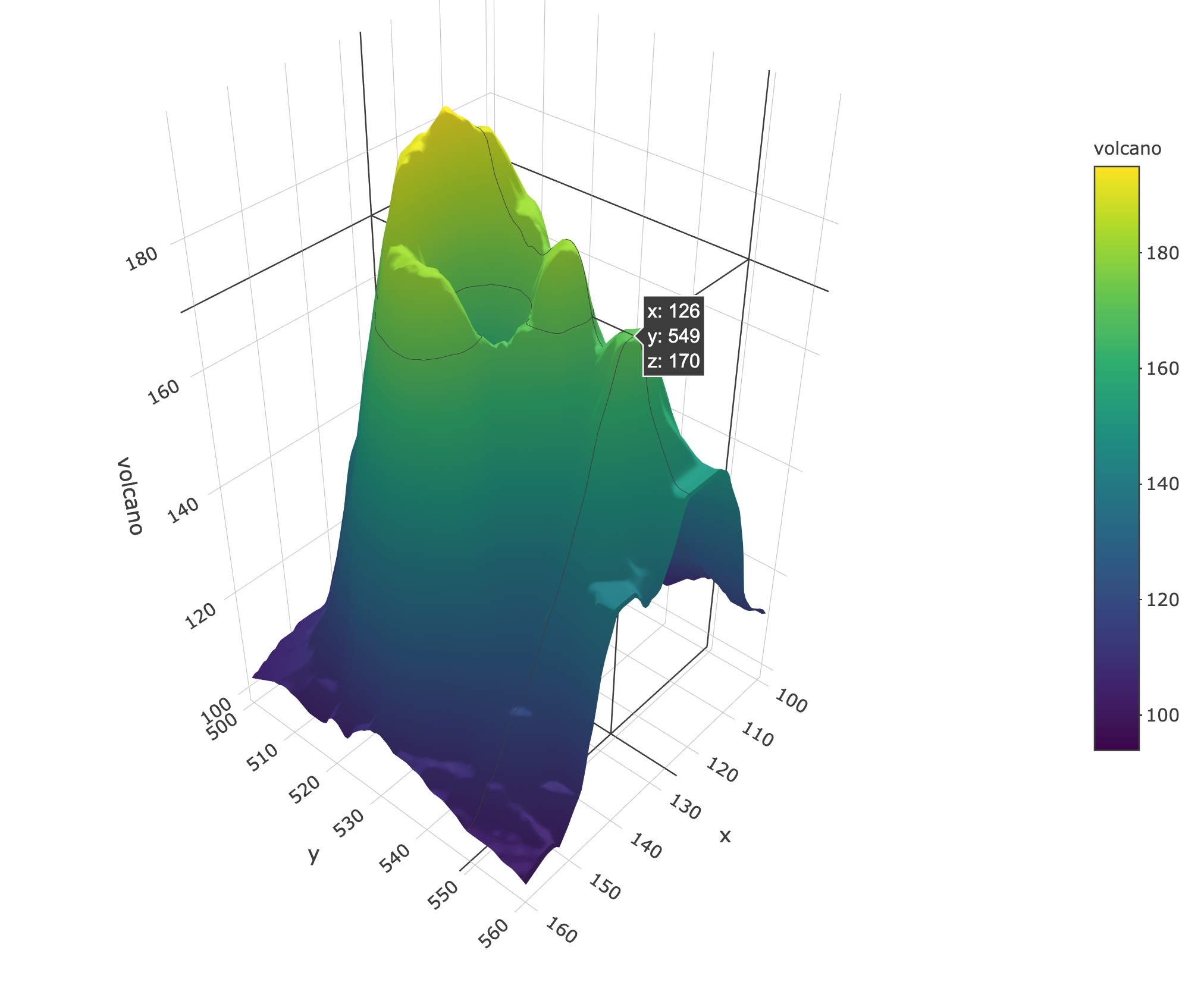
FIGURE 8.6: A 3D surface of volcano height.