33 Improving ggplotly()
Since the ggplotly() function returns a plotly object, we can use that object in the same way you can use any other plotly object. Modifying this object is always going to be useful when you want more control over certain (interactive) behavior that ggplot2 doesn’t provide an API to describe46, for example:
layout()for modifying aspects of the layout, which can be used to do many things, for example:- Change default
hovermodebehavior (See Figure 33.1). - Stylizing hover labels (
hoverlabel). - Changing click+drag mode (
dragmode) and/or constraining rectangular selections (dragmode='select') vertically or horizontally (selectdirection). - Add dropdowns https://plot.ly/r/dropdowns/, sliders https://plot.ly/r/sliders/, and rangesliders (see Figure 33.1).
- Change default
style()for modifying data-level attributes, which can be used to:config()for modifying the plot configuration, which can be used to:
In addition to using the functions above to modify ggplotly()’s return value, the ggplotly() function itself provides some arguments for controlling that return value. In this chapter, we’ll see a couple of them:
dynamicTicks: should plotly.js dynamically generate axis tick labels? Dynamic ticks are useful for updating ticks in response to zoom/pan interactions; however, they can not always reproduce labels as they would appear in the static ggplot2 image (see Figure 33.1).layerData: return a reference to which ggplot2 layer’s data (see Figure 33.5)?
33.1 Modifying layout
Any aspect of a plotly objects layout can be modified47 via the layout() function. By default, since it doesn’t always make sense to compare values, ggplotly() will usually set layout.hovermode='closest'. As shown in Figure 33.1, when we have multiple y-values of interest at a specific x-value, it can be helpful to set layout.hovermode='x'. Moreover, for a long time series graph like this, zooming in on the x-axis can be useful – dynamicTicks allows plotly.js to handle the generation of axis ticks and the rangeslider() allows us to zoom on the x-axis without losing the global context.
library(babynames)
nms <- filter(babynames, name %in% c("Sam", "Alex"))
p <- ggplot(nms) +
  geom_line(aes(year, prop, color = sex, linetype = name))

ggplotly(p, dynamicTicks = TRUE) %>%
  rangeslider() %>%
  layout(hovermode = "x")
FIGURE 33.1: Adding dynamicTicks, a rangeslider(), and a comparison hovermode to improve the interactive experience of a ggplotly() graph. For the interactive, see https://plotly-r.com/interactives/ggplotly-rangeslider.html
Since a single plotly object can only have one layout, modifying the layout of ggplotly() is fairly easy, but it’s trickier to modify the data underlying the graph.
33.2 Modifying data
As mentioned previously, ggplotly() translates each ggplot2 layer into one or more plotly.js traces. In this translation, it is forced to make a number of assumptions about trace attribute values that may or may not be appropriate for the use case. To demonstrate, consider Figure 33.2, which shows hover information for the points, the fitted line, and the confidence band. How could we make it so hover information is only displayed for the points and not for the fitted line and confidence band?
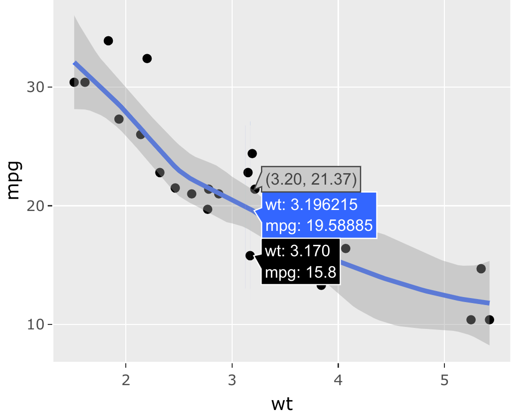
FIGURE 33.2: A scatterplot with a fitted line and confidence band.
The ggplot2 package doesn’t provide an API for interactive features, but by changing the hoverinfo attribute to "none", we can turn off hover for the relevant traces. This sort of task (i.e. modifying trace attribute values) is best achieved through the style() function. Before using it, you may want to study the underlying traces with plotly_json() which uses the listviewer package to display a convenient interactive view of the JSON object sent to plotly.js (de Jong and Russell 2016). By clicking on the arrow next to the data element, you can see the traces (data) behind the plot. As shown in Figure 33.3, we have three traces: one for the geom_point() layer and two for the geom_smooth() layer.
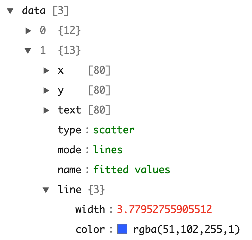
FIGURE 33.3: Using listviewer to inspect the JSON representation of a plotly object.
This output indicates that the fitted line and confidence band are implemented in the 2nd and 3rd trace of the plotly object, so to turn off the hover of those traces:
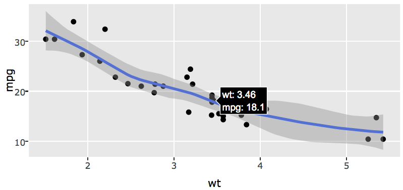
FIGURE 33.4: Using the style() function to modify hoverinfo attribute values of a plotly object created via ggplotly() (by default, ggplotly() displays hoverinfo for all traces). In this case, the hoverinfo for a fitted line and error bounds are hidden.
33.3 Leveraging statistical output
Since ggplotly() returns a plotly object, and plotly objects can have data attached to them, it attaches data from ggplot2 layer(s) (either before or after summary statistics have been applied). Furthermore, since each ggplot layer owns a data frame, it is useful to have some way to specify the particular layer of data of interest, which is done via the layerData argument in ggplotly(). Also, when a particular layer applies a summary statistic (e.g., geom_bin()), or applies a statistical model (e.g., geom_smooth()) to the data, it might be useful to access the output of that transformation, which is the point of the originalData argument in ggplotly().
p <- ggplot(mtcars, aes(x = wt, y = mpg)) +
   geom_point() + geom_smooth()
p %>%
  ggplotly(layerData = 2, originalData = FALSE) %>%
  plotly_data()
#> # A tibble: 80 x 14
#>       x     y  ymin  ymax    se flipped_aes PANEL group
#>   <dbl> <dbl> <dbl> <dbl> <dbl> <lgl>       <fct> <int>
#> 1  1.51  32.1  28.1  36.0  1.92 FALSE       1        -1
#> 2  1.56  31.7  28.2  35.2  1.72 FALSE       1        -1
#> 3  1.61  31.3  28.1  34.5  1.54 FALSE       1        -1
#> 4  1.66  30.9  28.0  33.7  1.39 FALSE       1        -1
#> 5  1.71  30.5  27.9  33.0  1.26 FALSE       1        -1
#> 6  1.76  30.0  27.7  32.4  1.16 FALSE       1        -1
#> # … with 74 more rows, and 6 more variables:
#> #   colour <chr>, fill <chr>, size <dbl>,
#> #   linetype <dbl>, weight <dbl>, alpha <dbl>
The data shown above is the data ggplot2 uses to actually draw the fitted values (as a line) and standard error bounds (as a ribbon). Figure 33.5 leverages this data to add additional information about the model fit; in particular, it adds a vertical lines and annotations at the x-values that are associated with the highest and lowest amount uncertainty in the fitted values. Producing a plot like this with ggplot2 would be impossible using geom_smooth() alone.48 Providing a simple visual clue like this can help combat visual misperceptions of uncertainty bands due to the sine illusion (VanderPlas and Hofmann 2015).
p %>%
  ggplotly(layerData = 2, originalData = FALSE) %>%
  add_fun(function(p) {
    p %>% slice(which.max(se)) %>%
      add_segments(x = ~x, xend = ~x, y = ~ymin, yend = ~ymax) %>%
      add_annotations("Maximum uncertainty", ax = 60)
  }) %>%
  add_fun(function(p) {
    p %>% slice(which.min(se)) %>%
      add_segments(x = ~x, xend = ~x, y = ~ymin, yend = ~ymax) %>%
      add_annotations("Minimum uncertainty")
  })
FIGURE 33.5: Leveraging data associated with a geom_smooth() layer to display additional information about the model fit.
In addition to leveraging output from StatSmooth, it is sometimes useful to leverage output of other statistics, especially for annotation purposes. Figure 33.6 leverages the output of StatBin to add annotations to a stacked bar chart. Annotation is primarily helpful for displaying the heights of bars in a stacked bar chart, since decoding the heights of bars is a fairly difficult perceptual task (Cleveland and McGill 1984). As result, it is much easier to compare bar heights representing the proportion of diamonds with a given clarity across various diamond cuts.
p <- ggplot(diamonds, aes(cut, fill = clarity)) +
  geom_bar(position = "fill")

ggplotly(p, originalData = FALSE) %>%
  mutate(ydiff = ymax - ymin) %>%
  add_text(
    x = ~x, y = ~(ymin + ymax) / 2,
    text = ~ifelse(ydiff > 0.02, round(ydiff, 2), ""),
    showlegend = FALSE, hoverinfo = "none",
    color = I("white"), size = I(9)
  )
FIGURE 33.6: Leveraging output from StatBin to add annotations to a stacked bar chart (created via geom_bar()) which makes it easier to compare bar heights.
Another useful application is labelling the levels of each piece/polygon output by StatDensity2d as shown in Figure 33.7. Note that, in this example, the add_text() layer takes advantage of ggplotly()’s ability to inherit aesthetics from the global mapping. Furthermore, since originalData is FALSE, it attaches the “built” aesthetics (i.e., the x/y positions after StatDensity2d has been applied to the raw data).
p <- ggplot(MASS::geyser, aes(x = waiting, y = duration)) +
  geom_density2d()

ggplotly(p, originalData = FALSE) %>%
  group_by(piece) %>%
  slice(which.min(y)) %>%
  add_text(
    text = ~level, size = I(16), color = I("black"), hoverinfo="none"
  )
FIGURE 33.7: Leveraging output from StatDensity2d to add annotations to contour levels.
References
Cleveland, William S, and Robert McGill. 1984. “Graphical Perception: Theory, Experimentation, and Application to the Development of Graphical Methods.” Journal of the American Statistical Association 79 (September): 531–54.
de Jong, Jos, and Kenton Russell. 2016. Listviewer: ’Htmlwidget’ for Interactive Views of R Lists. https://github.com/timelyportfolio/listviewer.
VanderPlas, Susan, and Heike Hofmann. 2015. “Signs of the Sine Illusion—Why We Need to Care.” Journal of Computational and Graphical Statistics 24 (4): 1170–90. https://doi.org/10.1080/10618600.2014.951547.
It can also be helpful for correcting translations that
ggplotly()doesn’t get quite right.↩︎Or, in the case of cumulative attributes, like
shapes,images,annotations, etc, these items will be added to the existing items↩︎It could be recreated by fitting the model via
loess(), obtaining the fitted values and standard error withpredict(), and feeding those results intogeom_line()/geom_ribbon()/geom_text()/geom_segment(), but that process is much more onerous.↩︎