
13 Arranging views
One technique essential to high-dimensional data visualization is the ability to arrange multiple views. By arranging multiple low-dimensional graphics of the same (or similar) high-dimensional data, one can put
local summaries and patterns into a global context. When arranging multiple plotly objects, you have some flexibility in terms of how you arrange them: you could use subplot() to merge multiple plotly object into a single object (useful for synchronizing zoom&pan events across multiple axes), place them in separate HTML tags (Section 13.2), or embedded in a larger system for intelligently managing many views (Section 13.3).
Ideally, when displaying multiple related data views, they are linked through an underlying data source to foster comparisons and enable posing of data queries (D. Cook, Buja, and Swayne 2007). Chapter 16.1 shows how to build upon these methods for arranging views to link them (client-side) as well.
13.1 Arranging plotly objects
The subplot() function provides a flexible interface for merging multiple plotly objects into a single object. It is more flexible than most trellis display frameworks (e.g., ggplot2’s facet_wrap()) as you don’t have to condition on a value of common variable in each display (Richard A. Becker 1996). Its capabilities and interface are similar to the grid.arrange() function from the gridExtra package, which allows you to arrange multiple grid grobs in a single view, effectively providing a way to arrange (possibly unrelated) ggplot2 and/or lattice plots in a single view (R Core Team 2016; Auguie 2016; Sarkar 2008). Figure 13.1 shows the most simple way to use subplot() which is to directly supply plotly objects.
library(plotly)
p1 <- plot_ly(economics, x = ~date, y = ~unemploy) %>%
  add_lines(name = "unemploy")
p2 <- plot_ly(economics, x = ~date, y = ~uempmed) %>%
  add_lines(name = "uempmed")
subplot(p1, p2)
FIGURE 13.1: The most basic use of subplot() to merge multiple plotly objects into a single plotly object.
Although subplot() accepts an arbitrary number of plot objects, passing a list of plots can save typing and redundant code when dealing with a large number of plots. Figure 13.2 shows one time series for each variable in the economics dataset and share the x-axis so that zoom/pan events are synchronized across each series:
vars <- setdiff(names(economics), "date")
plots <- lapply(vars, function(var) {
  plot_ly(economics, x = ~date, y = as.formula(paste0("~", var))) %>%
    add_lines(name = var)
})
subplot(plots, nrows = length(plots), shareX = TRUE, titleX = FALSE)
FIGURE 13.2: Five different economic variables on different y scales and a common x scale. Zoom and pan events in the x-direction are synchronized across plots.
Conceptually, subplot() provides a way to place a collection of plots into a table with a given number of rows and columns. The number of rows (and, by consequence, the number of columns) is specified via the nrows argument. By default each row/column shares an equal proportion of the overall height/width, but as shown in Figure 13.3 the default can be changed via the heights and widths arguments.

FIGURE 13.3: A visual diagram of controlling the heights of rows and widths of columns. In this particular example, there are 5 plots being placed in 2 rows and three columns.
This flexibility is quite useful for a number of visualizations, for example, as shown in Figure 13.4, a joint density plot is really of subplot of joint and marginal densities. The heatmaply package is great example of leveraging subplot() in a similar way to create interactive dendrograms (Galili 2016).
Click to show code
# draw random values from correlated bi-variate normal distribution
s <- matrix(c(1, 0.3, 0.3, 1), nrow = 2)
m <- mvtnorm::rmvnorm(1e5, sigma = s)
x <- m[, 1]
y <- m[, 2]
s <- subplot(
  plot_ly(x = x, color = I("black")),
  plotly_empty(),
  plot_ly(x = x, y = y, color = I("black")) %>%
    add_histogram2dcontour(colorscale = "Viridis"),
  plot_ly(y = y, color = I("black")),
  nrows = 2, heights = c(0.2, 0.8), widths = c(0.8, 0.2), margin = 0,
  shareX = TRUE, shareY = TRUE, titleX = FALSE, titleY = FALSE
)
layout(s, showlegend = FALSE)
FIGURE 13.4: A joint density plot with synchronized axes.
13.1.1 Recursive subplots
The subplot() function returns a plotly object so it can be modified like any other plotly object. This effectively means that subplots work recursively (i.e., you can have subplots within subplots). This idea is useful when your desired layout doesn’t conform to the table structure described in the previous section. In fact, you can think of a subplot of subplots like a spreadsheet with merged cells. Figure 13.5 gives a basic example where each row of the outer-most subplot contains a different number of columns.
Click to show code

FIGURE 13.5: Recursive subplots.
The concept is particularly useful when you want plot(s) in a given row to have different widths from plot(s) in another row. Figure 13.6 uses this recursive behavior to place many bar charts in the first row, and a single choropleth in the second row.
Click to show code
# specify some map projection/options
g <- list(
  scope = 'usa',
  projection = list(type = 'albers usa'),
  lakecolor = toRGB('white')
)
# create a map of population density
density <- state.x77[, "Population"] / state.x77[, "Area"]
map <- plot_geo(
  z = ~density, text = state.name,
  locations = state.abb, locationmode = 'USA-states'
) %>%
  layout(geo = g)
# create a bunch of horizontal bar charts
vars <- colnames(state.x77)
barcharts <- lapply(vars, function(var) {
  plot_ly(x = state.x77[, var], y = state.name) %>%
    add_bars(orientation = "h", name = var) %>%
    layout(showlegend = FALSE, hovermode = "y",
           yaxis = list(showticklabels = FALSE))
})
subplot(barcharts, margin = 0.01) %>%
  subplot(map, nrows = 2, heights = c(0.3, 0.7), margin = 0.1) %>%
  layout(legend = list(y = 1)) %>%
  colorbar(y = 0.5)
FIGURE 13.6: Multiple bar charts of US statistics by state in a subplot with a choropleth of population density.
13.1.2 Other approaches & applications
Using subplot() directly is not the only way to create multiple views of a dataset with plotly. In some special cases, like scatterplot matrices and generalized pair plots, we can take advantage of some special methods designed specifically for these use cases.
13.1.2.1 Scatterplot matrices
The plotly.js library provides a trace specifically designed and optimized for scatterplot matrices (splom). To use it, provide numeric variables to the dimensions attribute of the splom trace type.
dims <- dplyr::select_if(iris, is.numeric)
dims <- purrr::map2(dims, names(dims), ~list(values=.x, label=.y))
plot_ly(
  type = "splom", dimensions = setNames(dims, NULL),
  showupperhalf = FALSE, diagonal = list(visible = FALSE)
)
FIGURE 13.7: Linked brushing in a scatterplot matrix of the iris dataset. For the interactive, see https://plotly-r.com/interactives/splom.html
See https://plot.ly/r/splom/ for more options related to the splom trace type.
13.1.2.2 Generalized pairs plot
The generalized pairs plot is an extension of the scatterplot matrix to support both discrete and numeric variables (Emerson et al. 2013). The ggpairs() function from the GGally package provides an interface for creating these plots via ggplot2 (Schloerke et al. 2016). To implement ggpairs(), GGally introduces the notion of a matrix of ggplot2 plot objects that it calls ggmatrix(). As Figure 13.8 shows, the ggplotly() function has a method for converting ggmatrix objects directly:

FIGURE 13.8: A generalized pairs plot made via the ggpairs() function from the GGally package.
As it turns out, GGally use ggmatrix() as a building block for other visualizations, like model diagnostic plots (ggnostic()). Sections 16.4.6 and 16.4.7 demonstrates how to leverage linked brushing in the ggplotly() versions of these plots.
13.1.2.3 Trellis displays with subplot()
It’s true that ggplot2’s facet_wrap()/facet_grid() provides a simple way to create trellis displays, but for learning purposes, it can be helpful to learn how to implement a similar trellis display with plot_ly() and subplot(). Figure 13.9 demonstrates one approach, which leverages subplot()’s ability to reposition annotations and shapes. Specifically, the panel() function below, which defines the visualization method to be applied to each variable in the economics_long dataset, uses paper coordinates (i.e., graph coordinates on a normalized 0-1 scale) to place an annotation at the top-center of each panel as well as a rectangle shape behind the annotation. Note also the use of ysizemode = 'pixel' which gives the rectangle shape a fixed height (i.e., the rectangle height is always 16 pixels, regardless of the height of the trellis display).
Click to show code
library(dplyr)

panel <- . %>%
  plot_ly(x = ~date, y = ~value) %>%
  add_lines() %>%
  add_annotations(
    text = ~unique(variable),
    x = 0.5,
    y = 1,
    yref = "paper",
    xref = "paper",
    yanchor = "bottom",
    showarrow = FALSE,
    font = list(size = 15)
  ) %>%
  layout(
    showlegend = FALSE,
    shapes = list(
      type = "rect",
      x0 = 0,
      x1 = 1,
      xref = "paper",
      y0 = 0,
      y1 = 16,
      yanchor = 1,
      yref = "paper",
      ysizemode = "pixel",
      fillcolor = toRGB("gray80"),
      line = list(color = "transparent")
    )
  )

economics_long %>%
  group_by(variable) %>%
  do(p = panel(.)) %>%
  subplot(nrows = NROW(.), shareX = TRUE)
FIGURE 13.9: Creating a trellis display with subplot().
13.1.2.4 ggplot2 subplots
It’s possible to combine the convenience of ggplot2’s facet_wrap()/facet_grid() with the more flexible arrangement capabilities of subplot(). Figure 13.10 does this to show two different views of the economics_long data: the left-hand column displays each variable along time while the right-hand column shows violin plots of each variable. For the implementation, each column is created through ggplot2::facet_wrap(), but then the trellis displays are combined with subplot(). In this case, ggplot2 objects are passed directly to subplot(), but you can also use ggplotly() for finer control over the conversion of ggplot2 to plotly (see also Chapter 33) before supplying that result to subplot().
gg1 <- ggplot(economics_long, aes(date, value)) + geom_line() +
  facet_wrap(~variable, scales = "free_y", ncol = 1)
gg2 <- ggplot(economics_long, aes(factor(1), value)) +
  geom_violin() +
  facet_wrap(~variable, scales = "free_y", ncol = 1) +
  theme(axis.text = element_blank(), axis.ticks = element_blank())
subplot(gg1, gg2)
FIGURE 13.10: Arranging multiple faceted ggplot2 plots into a plotly subplot.
13.2 Arranging htmlwidgets
Since plotly objects are also htmlwidgets, any method that works for arranging htmlwidgets also works for plotly objects. Moreover, since htmlwidgets are also htmltools tags, any method that works for arranging htmltools tags also works for htmlwidgets. Here are three common ways to arrange components (e.g., htmlwidgets, htmltools tags, etc) in a single web-page:
- flexdashboard: An R package for arranging components into an opinionated dashboard layout. This package is essentially a special rmarkdown template that uses a simple markup syntax to define the layout.
- Bootstrap’s grid layout: Both the crosstalk and shiny packages provide ways to arrange numerous components via Bootstrap’s (a popular HTML/CSS framework) grid layout system.
- CSS flexbox: If you know some HTML and CSS, you can leverage CSS flexbox to arrange components via the htmltools package.
Although flexdashboard is a really excellent way to arrange web-based content generated from R, it can pay-off to know the other two approaches as their arrangement techniques are agnostic to an rmarkdown output format. In other words, approaches 2-3 can be used with any rmarkdown template21 or really any framework for website generation. Although Bootstrap grid layout system (2) is expressive and intuitive, using it in a larger website that also uses a different HTML/CSS framework (e.g. Bulma, Skeleton, etc) can cause issues. In that case, CSS flexbox (3) is a light-weight (i.e., no external CSS/JS dependencies) alternative that is less likely to introduce undesirable side-effects.
13.2.1 Flexdashboard
Figure 13.11 provides an example of embedding ggplotly() inside flexdashboard (Allaire 2016). Since flexdashboard is an rmarkdown template, it automatically comes with many of things that make rmarkdown great: ability to produce standalone HTML, integration with other languages, and thoughtful integration with RStudio products like Connect. There are many other things to like about flexdashboard, including lots of easy-to-use theming options, multiple pages, storyboards, and even shiny integration. Explaining how the flexdashboard package actually works is beyond the scope of this book, but you can visit the website for documentation and more examples https://rmarkdown.rstudio.com/flexdashboard/.
 https://plotly-r.com/flexdashboard.html" width="100%" />
FIGURE 13.11: An example of embedding ggplotly() graphs inside flexdashboard. See here for the interactive dashboard https://plotly-r.com/flexdashboard.html
13.2.2 Bootstrap grid layout
If you’re already familiar with shiny, you may already be familiar with functions like fluidPage(), fluidRow(), and column(). These R functions provide an interface from R to bootstrap’s grid layout system. That layout system is based on the notion of rows and columns where each row spans a width of 12 columns. Figure 13.12 demonstrates how one can use these functions to produce a standalone HTML page with three plotly graphs – with the first plot in the first row spanning the full width and the other 2 plots in the second row of equal width. To learn more about this fluidPage() approach to layouts, see https://shiny.rstudio.com/articles/layout-guide.html.
library(shiny)
p <- plot_ly(x = rnorm(100))
fluidPage(
  fluidRow(p),
  fluidRow(
    column(6, p), column(6, p)
  )
)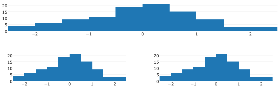
FIGURE 13.12: Arranging multiple htmlwidgets with fluidPage() from the shiny package.
It’s also worth noting another, somewhat similar, yet more succinct, interface to grid’s layout system provided by the bscols() function from the crosstalk package. You can think of it in a similar way to fluidRow(), but instead of defining column() width for each component individually, you can specify the width of several components at once through the widths argument. Also, importantly, this functions works recursively – it returns a collection of htmltools tags and accepts them as input as well. The code below produces the same result as above, but is a much more succinct way of doing so.
Bootstrap is much more than just its grid layout system, so beware – using either of these approaches will impose Bootstrap’s styling rules on other content in your webpage. If you are using another CSS framework for styling or just want to reduce the size of dependencies in your webpage, consider working with CSS flexbox instead of Bootstrap.
13.2.3 CSS flexbox
Cascading Style Sheet (CSS) flexbox is a relatively new CSS feature that most modern web browsers natively support.22 It aims to provide a general system for distributing space among multiple components in a container. Instead of covering this entire system, we’ll cover it’s basic functionality, which is fairly similar to Bootstrap’s grid layout system.
Creating a flexbox requires a flexbox container – in HTML speak, that means a <div> tag with a CSS style property of display: flex. By default, in this display setting, all the components inside that container will try fit in a single row. To allow ‘overflowing’ components the freedom to ‘wrap’ into new row(s), set the CSS property of flex-wrap: wrap in the parent container. Another useful CSS property to know about for the ‘parent’ container is justify-content: in the case of Figure 13.13, I’m using it to horizontally center the components. Moreover, since I’ve imposed a width of 40% for the first two plots, the net effect is that we have 2 plots in the first two (spanning 80% of the page width), then the third plot wraps onto a new line.
library(htmltools)
p <- plot_ly(x = rnorm(100))
# NOTE: you don't need browsable() in rmarkdown,
# but you do at the R prompt
browsable(div(
  style = "display: flex; flex-wrap: wrap; justify-content: center",
  div(p, style = "width: 40%; border: solid;"),
  div(p, style = "width: 40%; border: solid;"),
  div(p, style = "width: 100%; border: solid;")
))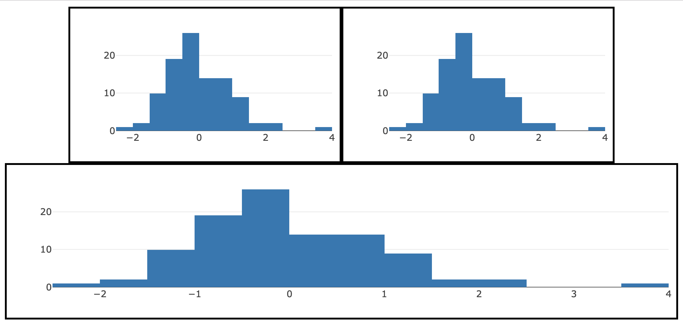
FIGURE 13.13: Arranging multiple htmlwidgets with CSS flexbox.
From the code example in Figure 13.13, you might notice that display: flex; flex-wrap: wrap is quite similar to Bootstrap grid layout system. The main difference is that, instead of specifying widths in terms of 12 columns, you have more flexibility with how to size things, as well as how you handle extra space. Here, in Figure 13.13 I’ve used widths that are relative to the page width, but you could also use fixed widths (using fixed widths, however, is generally frowned upon). For those that would like to learn about more details about CSS flexbox, see https://css-tricks.com/snippets/css/a-guide-to-flexbox/.
References
Allaire, JJ. 2016. Flexdashboard: R Markdown Format for Flexible Dashboards. https://CRAN.R-project.org/package=flexdashboard.
Auguie, Baptiste. 2016. GridExtra: Miscellaneous Functions for "Grid" Graphics. https://CRAN.R-project.org/package=gridExtra.
Cleveland, William S., and Ryan Hafen. 2014. “Divide and Recombine: Data Science for Large Complex Data.” Statistical Analysis and Data Mining: The ASA Data Science Journal 7 (6): 425–33.
Cook, Dianne, Andreas Buja, and Deborah F Swayne. 2007. “Interactive High-Dimensional Data Visualization.” Journal of Computational and Graphical Statistics, December, 1–23.
Dang, Tuan Nhon, and Leland Wilkinson. 2012. “Timeseer: Detecting interesting distributions in multiple time series data.” VINCI, October, 1–9.
Emerson, John W., Walton A. Green, Barret Schloerke, Jason Crowley, Dianne Cook, Heike Hofmann, and Hadley Wickham. 2013. “The Generalized Pairs Plot.” Journal of Computational and Graphical Statistics 22 (1): 79–91. https://doi.org/10.1080/10618600.2012.694762.
Galili, Tal. 2016. Heatmaply: Interactive Heat Maps Using ’Plotly’. https://CRAN.R-project.org/package=heatmaply.
Guha, Saptarshi, Ryan Hafen, Jeremiah Rounds, Jin Xia, Jianfu Li, Bowei Xi, and William S. Cleveland. 2012. “Large Complex Data: Divide and Recombine with Rhipe.” The ISI’s Journal for the Rapid Dissemination of Statistics Research, August, 53–67.
Hafen, R., L. Gosink, J. McDermott, K. Rodland, K. K. V. Dam, and W. S. Cleveland. 2013. “Trelliscope: A System for Detailed Visualization in the Deep Analysis of Large Complex Data.” In Large-Scale Data Analysis and Visualization (Ldav), 2013 Ieee Symposium on, 105–12. https://doi.org/10.1109/LDAV.2013.6675164.
Hafen, Ryan. 2016. Trelliscope: Create and Navigate Large Multi-Panel Visual Displays. https://CRAN.R-project.org/package=trelliscope.
Hafen, Ryan, and Barret Schloerke. 2018. Trelliscopejs: Create Interactive Trelliscope Displays. https://github.com/hafen/trelliscopejs.
R Core Team. 2016. R: A Language and Environment for Statistical Computing. Vienna, Austria: R Foundation for Statistical Computing. https://www.R-project.org/.
Richard A. Becker, Ming-Jen Shyu, William S. Cleveland. 1996. “The Visual Design and Control of Trellis Display.” Journal of Computational and Graphical Statistics 5 (2): 123–55. http://www.jstor.org/stable/1390777.
Sarkar, Deepayan. 2008. Lattice: Multivariate Data Visualization with R. New York: Springer. http://lmdvr.r-forge.r-project.org.
Schloerke, Barret, Jason Crowley, Di Cook, Francois Briatte, Moritz Marbach, Edwin Thoen, Amos Elberg, and Joseph Larmarange. 2016. GGally: Extension to ’Ggplot2’.
Tukey, J. W., and P. A. Tukey. 1985. “Computer Graphics and Exploratory Data Analysis: An Introduction.” In In Proceedings of the Sixth Annual Conference and Exposition: Computer Graphics85.
Wilkinson, Leland, Anushka Anand, and Robert Grossman. 2005. “Graph-Theoretic Scagnostics.” In Proceedings of the Proceedings of the 2005 Ieee Symposium on Information Visualization, 21. INFOVIS ’05. Washington, DC, USA: IEEE Computer Society. https://doi.org/10.1109/INFOVIS.2005.14.
Wilkinson, Leland, and Graham Wills. 2008. “Scagnostics Distributions.” Journal of Computational and Graphical Statistics 17 (2): 473–91.
Although HTML can not possibly render in a pdf or word document, knitr can automatically detect a non-HTML output format and embed a static image of the htmlwidget via the webshot package (Chang 2016).↩︎
For a full reference of which browsers/versions support flexbox, see https://caniuse.com/#feat=flexbox.↩︎