1 Preface
1.1 Why interactive web graphics from R?
As Wickham and Grolemund (2018) argue, the exploratory phase of a data science workflow (Figure 1.1) requires lots of iteration between data manipulation, visualization, and modeling. Achieving these tasks through a programming language like R offers the opportunity to scale and automate tasks, document and track them, and reliably reproduce their output. That power, however, typically comes at the cost of increasing the amount of cognitive load involved relative to a GUI-based system.1 R packages like the tidyverse have been incredibly successful due to their ability to limit cognitive load without removing the benefits of performing analysis via code. Moreover, the tidyverse’s unifying principles of designing for humans, consistency, and composability makes iteration within and between these stages seamless – an important but often overlooked challenge in exploratory data analysis (EDA) (Tidyverse team 2018).

FIGURE 1.1: The stages of a data science workflow from Wickham and Grolemund (2018).
In fact, packages within the tidyverse such as dplyr (transformation) and ggplot2 (visualization) are such productive tools that many analysts use static ggplot2 graphics for EDA. Then, when it comes to communicating results, some analysts switch to another tool or language altogether (e.g., JavaScript) to generate interactive web graphics presenting their most important findings (Yau 2016; Quealy 2013). Unfortunately, this requires a heavy context switch that requires a totally different skillset and impedes productivity. Moreover, for the average analyst, the opportunity costs involved with becoming competent with the complex world of web technologies is simply not worth the required investment.
Even before the web, interactive graphics were shown to have great promise in aiding the exploration of high-dimensional data (D. Cook, Buja, and Swayne 2007). The ASA maintains an incredible video library, http://stat-graphics.org/movies/, documenting the use of interactive statistical graphics for tasks that otherwise wouldn’t have been easy or possible using numerical summaries and/or static graphics alone. Roughly speaking, these tasks tend to fall under three categories:
- Identifying structure that would otherwise go missing (J. W. Tukey and Fisherkeller 1973).
- Diagnosing models and understanding algorithms (Wickham, Cook, and Hofmann 2015).
- Aiding the sense-making process by searching for information quickly without fully specified questions (Unwin and Hofmann 1999).
Today, you can find and run some of these and similar Graphical User Interface (GUI) systems for creating interactive graphics: DataDesk https://datadescription.com/, GGobi http://www.ggobi.org/, Mondrian http://www.theusrus.de/Mondrian/, JMP https://www.jmp.com, Tableau https://www.tableau.com/. Although these GUI-based systems have nice properties, they don’t gel with a code-based workflow: any tasks you complete through a GUI likely can’t be replicated without human intervention. That means, if at any point, the data changes, and analysis outputs must be regenerated, you need to remember precisely how to reproduce the outcome, which isn’t necessarily easy, trustworthy, or economical. Moreover, GUI-based systems are typically ‘closed’ systems that don’t allow themselves to be easily customized, extended, or integrated with another system.
Programming interactive graphics allows you to leverage all the benefits of a code-based workflow while also helping with tasks that are difficult to accomplish with code alone. For an example, if you were to visualize engine displacement (displ) versus miles per gallon (hwy) using the mpg dataset, you might wonder: “what are these cars with an unusually high value of hwy given their displ?”. Rather than trying to write code to query those observations, it would be more easier and intuitive to draw an outline around the points to query the data behind them.
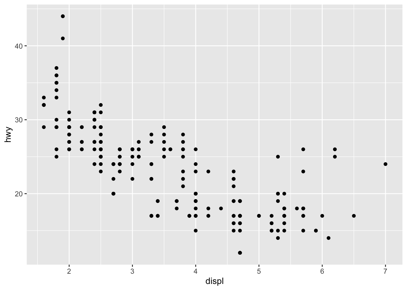
FIGURE 1.2: A scatterplot of engine displacement versus miles per gallon made with the ggplot2 package.
Figure 1.3 demonstrates how we can transform Figure 1.2 into an interactive version that can be used to query and inspect points of interest. The framework that enables this kind of linked brushing is discussed in depth within Section 16.1, but the point here is that the added effort required to enable such functionality is relatively small. This is important, because although interactivity can augment exploration by allowing us to pursue follow-up questions, it’s typically only practical when we can create and alter them quickly. That’s because, in a true exploratory setting, you have to make lots of visualizations, and investigate lots of follow-up questions, before stumbling across something truly valuable.
library(plotly)
m <- highlight_key(mpg)
p <- ggplot(m, aes(displ, hwy)) + geom_point()
gg <- highlight(ggplotly(p), "plotly_selected")
crosstalk::bscols(gg, DT::datatable(m))
FIGURE 1.3: Linked brushing in a scatterplot to query more information about points of interest. By lasso selecting a region of unusual points, we learn that corvette’s have an unusually high miles per gallon considering the engine size. For the interactive, see https://plotly-r.com/interactives/mpg-lasso.html
When a valuable insight surfaces, since the code behind Figure 1.3 generates HTML, the web-based graphic can be easily shared with collaborators through email and/or incorporated inside a larger automated report or website. Moreover, since these interactive graphics are based on the htmlwidgets framework, they work seamlessly inside of larger rmarkdown documents, inside shiny apps, RStudio, Jupyter notebooks, the R prompt, and more. Being able to share interactive graphics with collaborators through these different mediums enhances the conversation – your colleagues can point out things you may not yet have considered and, in some cases, they can get immediate responses from the graphics themselves.
In the final stages of an analysis, when it comes time to publish your work to a general audience, rather than relying on the audience to interact with the graphics and discover insight for themselves, it’s always a good idea to clearly highlight your findings. For example, from Figure 1.3, we’ve learned that most of these unusual points can be explained by a single feature of the data (model == 'corvette'). As shown in Figure 1.4, the geom_mark_hull() function from the ggforce package provides a helpful way to annotate those points with a hull. Moreover, as Chapter 12 demonstrates, it can also be helpful to add and/or edit annotations interactively when preparing a graphic for publication.
library(ggforce)
ggplot(mpg, aes(displ, hwy)) +
  geom_point() +
  geom_mark_hull(aes(filter = model == "corvette", label = model)) +
  labs(
    title = "Fuel economy from 1999 to 2008 for 38 car models",
    caption = "Source: https://fueleconomy.gov/",
    x = "Engine Displacement",
    y = "Miles Per Gallon"
  )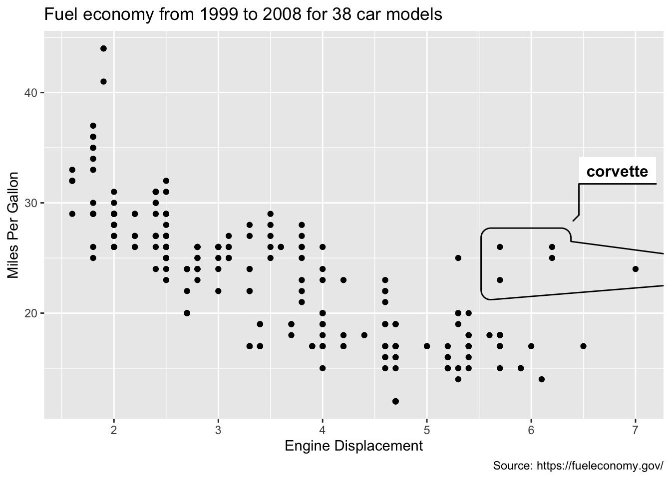
FIGURE 1.4: Using the ggforce package to annotate the corvette’s in this dataset.
This simple example quickly shows how interactive web graphics can assist EDA (for another, slightly more in-depth example, see Section 2.3). Being able to program these graphics from R allows one to combine their functionality within a world-class computing environment for data analysis and statistics. Programming interactive graphics may not be as intuitive as using a GUI-based system, but making the investment pays dividends in terms of workflow improvements: automation, scaling, provenance, and flexibility.
1.2 What you will learn
This book provides a foundation for learning how to make interactive web-based graphics for data analysis from R via plotly, without assuming any prior experience with web technologies. The goal is to provide the context you need to go beyond copying existing plotly examples to having a useful mental model of the underlying framework, its capabilities, and how it fits into the larger R ecosystem. By learning this mental model, you’ll have a better understanding of how to create more sophisticated visualizations, fix common issues, improve performance, understand the limitations, and even contribute back to the project itself. You may already be familiar with existing plotly documentation (e.g., https://plot.ly/r/), which is essentially a language-agnostic how-to guide, but this book is meant to be more holistic tutorial written by and for the R user.
This book also focuses primarily on features that are unique to the plotly R package (i.e., things that don’t work the same for Python or JavaScript). This ranges from creation of a single graph using the plot_ly() special named arguments that make it easier to map data to visuals:
FIGURE 1.5: An example of what you’ll learn: Figure 2.7. For the interactive, see https://plotly-r.com/interactives/intro-show-hide-preview.html
To its ability to link multiple data views purely client-side (see Section 16.1):
FIGURE 1.6: An example of what you’ll learn: Figure 16.21. For the interactive, see https://plotly-r.com/interactives/storms-preview.html
To advanced server-side linking with shiny to implement responsive and scalable crossfilters (see Section 17.4.2):
FIGURE 1.7: An example of what you’ll learn: Figure 17.28. For the interactive, see https://plotly-r.com/interactives/shiny-crossfilter-preview.html
By going through the code behind these examples, you’ll see that many of them leverage other R packages in their implementation. To highlight a few of the R packages that you’ll see:
- dplyr and tidyr
- For transforming data into a form suitable for the visualization method.
- ggplot2 and friends (e.g., GGally, ggmosaic, etc)
- For creating plotly visualizations that would be tedious to implement without
ggplotly().
- For creating plotly visualizations that would be tedious to implement without
- sf, rnaturalearth, cartogram
- For obtaining and working with geo-spatial data structures in R.
- stats, MASS, broom, and forecast
- For working with statistical models and summaries.
- shiny
- For running R code in response to user input.
- htmltools, htmlwidgets
- For combining multiple views and saving the result.
This book contains six parts and each part contains numerous chapters. A summary of each part is provided below.
Creating views: introduces the process of transforming data into graphics via plotly’s programmatic interface. It focuses mostly on
plot_ly(), which can interface directly with the underlying plotly.js graphing library, but emphasis is put on features unique to theRpackage that make it easier to transform data into graphics. Another way to create graphs with plotly is to use theggplotly()function to transform ggplot2 graphs into plotly graphs. Section 2.3 discusses when and whyggplotly()might be desirable toplot_ly(). It’s also worth mentioning that this part (nor the book as a whole) does not intend to cover every possible chart type and option available in plotly – it’s more of a presentation of the most generally useful techniques with the greaterRecosystem in mind. For a more exhaustive gallery of examples of what plotly itself is capable of, see https://plot.ly/r/.Publishing views: discusses various techniques for exporting (as well as embedding) plotly graphs to various file formats (e.g., HTML, svg, pdf, png, etc). Also, Chapter 12 demonstrates how one could leverage editable layout components HTML to touch-up a graph, then export to a static file format of interest before publication. Indeed, this book was created using the techniques from this section.
Combining multiple views: demonstrates how to combine multiple data views into a single web page (arranging) or graphic (animation). Most of these techniques are shown using plotly graphs, but techniques from Section 13.2 extend to any HTML content generated via htmltools (which includes htmlwidgets).
Linking multiple views: provides an overview of the two models for linking plotly graph(s) to other data views. The first model, covered in Section 16.1, outlines plotly’s support for linking views purely client-side, meaning the resulting graphs render in any web browser on any machine without requiring external software. The second model, covered in Chapter 17, demonstrates how to link plotly with other views via shiny, a reactive web application framework for
R. Relatively speaking, the second model grants theRuser way more power and flexibility, but comes at the cost of requiring more computational infrastructure. That being said, RStudio provides accessible resources for deploying shiny apps https://shiny.rstudio.com/articles/#deployment.Custom behavior with JavaScript: demonstrates various ways to customize plotly graphs by writing custom JavaScript to handle certain user events. This part of the book is designed to be approachable for
Rusers that want to learn just enough JavaScript to plotly to do something it doesn’t “natively” support.Various special topics: offers a grab-bag of topics that address common questions, mostly related to the customization of plotly graphs in
R.
You might already notice that this book often uses the term ‘view’ or ‘data view’, so here we take a moment to frame its use in a wider context. As Wills (2008) puts it: “a ‘data view’ is anything that gives the user a way of examining data so as to gain insight and understanding. A data view is usually thought of as a barchart, scatterplot, or other traditional statistical graphic, but we use the term more generally, including ‘views’ such as the results of a regression analysis, a neural net prediction, or a set of descriptive statistics”. In this book, more often than not, the term ‘view’ typically refers to a plotly graph or other htmlwidgets (e.g., DT, leaflet, etc). In particular, Section 16.1 is all about linking multiple htmlwidgets together through a graphical database querying framework. However, the term ‘view’ takes on a more general interpretation in Chapter 17 since the reactive programming framework that shiny provides allows us to have a more general conversation surrounding linked data views.
1.3 What you won’t learn (much of)
1.3.1 Web technologies
Although this book is fundamentally about creating web graphics, it does not aim to teach you web technologies (e.g., HTML, SVG, CSS, JavaScript, etc). It’s true that mastering these technologies grants you the ability to build really impressive websites, but even expert web developers would say their skillset is much better suited for expository rather than exploratory visualization. That’s because, most web programming tools are not well-suited for the exploratory phase of a data science workflow where iteration between data visualization, transformation, and modeling is a necessary task that often impedes hypothesis generation and sense-making. As a result, for most data analysts whose primary function is to derive insight from data, the opportunity costs involved with mastering web technologies is usually not worth the investment.
That being said, learning a little about web technologies can have a relatively large payoff with directed learning and instruction. In Chapter 18, you’ll learn how to customize plotly graphs with JavaScript – even if you haven’t seen JavaScript before, this chapter should be approachable, insightful, and provide you with some useful examples.
1.3.2 d3js
The JavaScript library D3 is a great tool for data visualization assuming you’re familiar with web technologies and are primarily interested in expository (not exploratory) visualization. There are already lots of great resources for learning D3, including the numerous books by Murray (2013) and Murray (2017). It’s worth noting, however, if you do know D3, you can easily leverage it from a web page that are already a plotly graph, as demonstrated in Figure 22.1.
1.3.3 ggplot2
The book does contain some ggplot2 code examples (which are then converted to plotly via ggplotly()), but it’s not designed to teach you ggplot2. For those looking to learn ggplot2, I recommend using the learning materials listed at https://ggplot2.tidyverse.org.
1.3.4 Graphical data analysis
How to perform data analysis via graphics (carefully, correctly, and creatively) is a large topic unto itself. Although this book does have examples of graphical data analysis, it does not aim to provide a comprehensive foundation. For nice comprehensive resources on the topic, see Unwin (2015) and D. Cook and Swayne (2007).
1.3.5 Data visualization best practices
Encoding information in a graphic (concisely and effectively) is a large topic unto itself. Although this book does have some ramblings related to best practices in data visualization, it does not aim to provide a comprehensive foundation. For some approachable and fun resources on the topic, see Tufte (2001a), Yau (2011), Healey (2018), and Wilke (2018).
1.4 Prerequisites
For those new to R and/or data visualization, R for Data Science provides an excellent foundation for understanding the vast majority of concepts covered in this book (Wickham and Grolemund 2018). In particular, if you have a solid grasp on Part I: Explore, Part II: Wrangle, and Part III: Program, you should be able to understand almost everything here. Although not explicitly covered, the book does make references to (and was creating using) rmarkdown, so if you’re new to rmarkdown, I also recommend reading the R Markdown chapter.
1.5 Run code examples
This book contains many code examples in an effort to teach the art and science behind creating interactive web-based graphics using plotly. To interact with the code results, you may either: (1) click on the static graphs hosted online at https://plotly-r.com and/or execute the code in a suitable computational environment. Most code examples assume you already have the plotly package loaded:
If a particular code chunk doesn’t work, you may need to load packages from previous examples in the chapter (some examples assume you’re following the chapter in a linear fashion).
If you’d like to run examples on your local machine (instead of RStudio Cloud), you can install all the necessary R packages with:
Visit http://bit.ly/plotly-book-cloud for a cloud-based instance of RStudio with all the required software to run the code examples in this book.
1.6 Getting help and learning more
As Wickham and Grolemund (2018) states, “This book is not an island; there is no single resource that will allow you to master R [or plotly]. As you start to apply the techniques described in this book to your own data you will soon find questions that I do not answer. This section describes a few tips on how to get help, and to help you keep learning.” These tips on how to get help (e.g., Google, StackOverflow, Twitter, etc) also apply to getting help with plotly. RStudio’s community is another great place to ask broader questions about all things R and plotly. It’s worth mentioning that the R community is incredibly welcoming, compassionate, and generous; especially if you can demonstrate that you’ve done your research and/or provide minimally reproducible example of your problem.
1.7 Acknowledgements
This book wouldn’t be possible without the generous assistance and mentorship of many people:
- Heike Hofmann and Di Cook for their mentorship and many helpful conversations about interactive graphics.
- Toby Dylan Hocking for many helpful conversations, his mentorship in the
Rpackages animint and plotly, and laying the original foundation behindggplotly(). - Joe Cheng for many helpful conversations and inspiring Section 16.1.
- Étienne Tétreault-Pinard, Alex Johnson, and the other plotly.js core developers for responding to my feature requests and bug reports.
- Yihui Xie for his work on knitr, rmarkdown, bookdown, bookdown-crc, and responding to my feature requests.
- Anthony Unwin for helpful feedback, suggestions, and for inspiring Figure 16.13.
- Hadley Wickham and the ggplot2 team for maintaining ggplot2.
- Hadley Wickham and Garret Grolemund for writing R for Data Science and allowing me to model this introduction after their introduction.
- Kent Russell for contributions to plotly, htmlwidgets, and reactR.
- Adam Loy for inspiring Figure 14.5.
- Many other R community members who contributed to the plotly package and provided feedback and corrections for this book.
1.8 Colophon
An online version of this book is available at https://plotly-r.com. It will continue to evolve in between reprints of the physical book. The source of the book is available at https://github.com/cpsievert/plotly_book. The book is powered by https://bookdown.org which makes it easy to turn R markdown files into HTML, PDF, and EPUB.
This book was built with the following computing environment:
devtools::session_info("plotly")
#> ─ Session info ──────────────────────────────────────
#>  setting  value
#>  version  R version 3.6.1 (2019-07-05)
#>  os       macOS Mojave 10.14.5
#>  system   x86_64, darwin15.6.0
#>  ui       X11
#>  language (EN)
#>  collate  en_US.UTF-8
#>  ctype    en_US.UTF-8
#>  tz       America/Chicago
#>  date     2019-10-07
#>
#> ─ Packages ──────────────────────────────────────────
#>  package      * version    date       lib
#>  askpass        1.1        2019-01-13 [1]
#>  assertthat     0.2.1      2019-03-21 [1]
#>  backports      1.1.5      2019-10-02 [1]
#>  base64enc      0.1-3      2015-07-28 [1]
#>  BH             1.69.0-1   2019-01-07 [1]
#>  cli            1.1.0      2019-03-19 [1]
#>  colorspace     1.4-1      2019-03-18 [1]
#>  crayon         1.3.4      2017-09-16 [1]
#>  crosstalk      1.0.0      2016-12-21 [1]
#>  curl           4.2        2019-09-24 [1]
#>  data.table     1.12.4     2019-10-03 [1]
#>  digest         0.6.21     2019-09-20 [1]
#>  dplyr        * 0.8.3      2019-07-04 [1]
#>  ellipsis       0.3.0      2019-09-20 [1]
#>  fansi          0.4.0      2018-10-05 [1]
#>  ggplot2      * 3.2.1.9000 2019-10-07 [1]
#>  glue           1.3.1      2019-03-12 [1]
#>  gtable         0.3.0      2019-03-25 [1]
#>  hexbin         1.27.3     2019-05-14 [1]
#>  htmltools      0.3.6.9004 2019-10-07 [1]
#>  htmlwidgets    1.5.1      2019-10-07 [1]
#>  httpuv         1.5.2      2019-09-11 [1]
#>  httr           1.4.1      2019-08-05 [1]
#>  jsonlite       1.6        2018-12-07 [1]
#>  labeling       0.3        2014-08-23 [1]
#>  later          1.0.0      2019-09-17 [1]
#>  lattice        0.20-38    2018-11-04 [1]
#>  lazyeval       0.2.2      2019-03-15 [1]
#>  lifecycle      0.1.0      2019-08-01 [1]
#>  magrittr       1.5        2014-11-22 [1]
#>  MASS           7.3-51.4   2019-03-31 [1]
#>  Matrix         1.2-17     2019-03-22 [1]
#>  mgcv           1.8-29     2019-09-20 [1]
#>  mime           0.7        2019-06-11 [1]
#>  munsell        0.5.0      2018-06-12 [1]
#>  nlme           3.1-141    2019-08-01 [1]
#>  openssl        1.4.1      2019-07-18 [1]
#>  pillar         1.4.2      2019-06-29 [1]
#>  pkgconfig      2.0.3      2019-09-22 [1]
#>  plogr          0.2.0      2018-03-25 [1]
#>  plotly       * 4.9.0.9000 2019-10-07 [1]
#>  plyr           1.8.4      2016-06-08 [1]
#>  promises       1.1.0      2019-09-25 [1]
#>  purrr          0.3.2.9000 2019-09-30 [1]
#>  R6             2.4.0      2019-02-14 [1]
#>  RColorBrewer   1.1-2      2014-12-07 [1]
#>  Rcpp           1.0.2      2019-07-25 [1]
#>  reshape2       1.4.3      2017-12-11 [1]
#>  rlang          0.4.0.9003 2019-10-07 [1]
#>  scales         1.0.0.9000 2019-07-19 [1]
#>  shiny          1.3.2      2019-10-07 [1]
#>  sourcetools    0.1.7      2018-04-25 [1]
#>  stringi        1.4.3      2019-03-12 [1]
#>  stringr        1.4.0      2019-02-10 [1]
#>  sys            3.3        2019-08-21 [1]
#>  tibble         2.1.3      2019-06-06 [1]
#>  tidyr          1.0.0      2019-09-11 [1]
#>  tidyselect     0.2.5      2018-10-11 [1]
#>  utf8           1.1.4      2018-05-24 [1]
#>  vctrs          0.2.0.9003 2019-10-01 [1]
#>  viridisLite    0.3.0      2018-02-01 [1]
#>  withr          2.1.2      2018-03-15 [1]
#>  xtable         1.8-4      2019-04-21 [1]
#>  yaml           2.2.0      2018-07-25 [1]
#>  zeallot        0.1.0      2018-01-28 [1]
#>  source
#>  CRAN (R 3.6.0)
#>  CRAN (R 3.6.0)
#>  CRAN (R 3.6.0)
#>  CRAN (R 3.6.0)
#>  CRAN (R 3.6.0)
#>  CRAN (R 3.6.0)
#>  CRAN (R 3.6.0)
#>  CRAN (R 3.6.0)
#>  CRAN (R 3.6.0)
#>  CRAN (R 3.6.1)
#>  CRAN (R 3.6.1)
#>  CRAN (R 3.6.1)
#>  CRAN (R 3.6.0)
#>  CRAN (R 3.6.1)
#>  CRAN (R 3.6.0)
#>  local
#>  CRAN (R 3.6.0)
#>  CRAN (R 3.6.0)
#>  CRAN (R 3.6.0)
#>  local
#>  local
#>  CRAN (R 3.6.1)
#>  CRAN (R 3.6.1)
#>  CRAN (R 3.6.0)
#>  CRAN (R 3.6.0)
#>  Github (r-lib/later@0364de9)
#>  CRAN (R 3.6.1)
#>  CRAN (R 3.6.0)
#>  CRAN (R 3.6.0)
#>  CRAN (R 3.6.0)
#>  CRAN (R 3.6.1)
#>  CRAN (R 3.6.1)
#>  CRAN (R 3.6.0)
#>  CRAN (R 3.6.0)
#>  CRAN (R 3.6.0)
#>  CRAN (R 3.6.0)
#>  CRAN (R 3.6.1)
#>  CRAN (R 3.6.0)
#>  CRAN (R 3.6.1)
#>  CRAN (R 3.6.0)
#>  local
#>  CRAN (R 3.6.0)
#>  Github (rstudio/promises@39faf86)
#>  Github (tidyverse/purrr@9edf0ca)
#>  CRAN (R 3.6.0)
#>  CRAN (R 3.6.0)
#>  CRAN (R 3.6.1)
#>  CRAN (R 3.6.0)
#>  Github (r-lib/rlang@09fda4a)
#>  Github (r-lib/scales@7f6f4a5)
#>  local
#>  CRAN (R 3.6.0)
#>  CRAN (R 3.6.0)
#>  CRAN (R 3.6.0)
#>  CRAN (R 3.6.0)
#>  CRAN (R 3.6.0)
#>  CRAN (R 3.6.0)
#>  CRAN (R 3.6.0)
#>  CRAN (R 3.6.0)
#>  Github (r-lib/vctrs@bc20422)
#>  CRAN (R 3.6.0)
#>  CRAN (R 3.6.0)
#>  CRAN (R 3.6.0)
#>  CRAN (R 3.6.0)
#>  CRAN (R 3.6.0)
#>
#> [1] /Library/Frameworks/R.framework/Versions/3.6/Resources/library
References
Cook, Dianne, Andreas Buja, and Deborah F Swayne. 2007. “Interactive High-Dimensional Data Visualization.” Journal of Computational and Graphical Statistics, December, 1–23.
Cook, Dianne, and Deborah F. Swayne. 2007. Interactive and Dynamic Graphics for Data Analysis : With R and Ggobi. Use R ! New York: Springer. http://www.ggobi.org/book/.
Healey, Kieran. 2018. Data Visualization: A Practical Introduction. Princeton University Press. https://kieranhealy.org/publications/dataviz/.
J. W. Tukey, J. H. Friedman, and M. A. Fisherkeller. 1973. “Stanford Linear Accelerator.” http://stat-graphics.org/movies/prim9.html.
Murray, Scott. 2013. Interactive Data Visualization for the Web: An Introduction to Designing with D3. O’Reilly.
Murray, Scott. 2017. D3.js in Action. Manning.
Quealy, Kevin. 2013. 19 Sketches of Quarterback Timelines. https://web.archive.org/web/20180416011941/http://kpq.github.io/chartsnthings/2013/09/19-sketches-of-quarterback-timelines.html.
Tidyverse team. 2018. Tidyverse Desing Principles. https://principles.tidyverse.org.
Tufte, Edward. 2001a. The Visual Display of Quantitative Information. Graphics Press.
Unwin, Antony. 2015. Graphical Data Analysis with R. CRC Press. http://www.gradaanwr.net.
Unwin, A. R., and H. Hofmann. 1999. “GUI and Command-Line — Conflict or Synergy?” In Computing Science and Statistics, Proceedings of the 31st Symposium on the Interface, edited by K. Berk and M. Pourahmadi, 31:246–53. Chicago: Interface Foundation.
Wickham, Hadley, Dianne Cook, and Heike Hofmann. 2015. “Visualizing Statistical Models: Removing the Blindfold.” Statistical Analysis and Data Mining: The ASA Data Science Journal 8 (4): 203–25.
Wickham, Hadley, and Garrett Grolemund. 2018. R for Data Science. O’Reilly.
Wilke, Claus. 2018. Fundamentals of Data Visualization. O’Reilly. https://serialmentor.com/dataviz/.
Wills, Graham. 2008. “Linked Data Views.” In Handbook of Data Visualization, 217–41. Berlin, Heidelberg: Springer Berlin Heidelberg. https://doi.org/10.1007/978-3-540-33037-0_10.
Yau, Nathan. 2011. Visualize This: The FlowingData Guide to Design, Visualization, and Statistics. Wiley.
Yau, Nathan. 2016. What I Use to Visualize Data. https://flowingdata.com/2016/03/08/what-i-use-to-visualize-data/.